The long-awaited reveal of the Nintendo Switch 2 features and game lineup has finally arrived, and gamers everywhere are reacting to the first real look at Nintendo’s next console/handheld hybrid. 2017’s Nintendo Switch launch kicked off the most successful era of the company’s history, and it is riding that wave straight into the Nintendo Switch 2’s June 2025 release. While the launch lineup for the Nintendo Switch 2 looks small at the moment, many of the games announced for the system look very promising, especially the handful of first-party titles that Nintendo revealed at its April Direct.
Chief among those titles are Mario Kart World and Donkey Kong Bananza, each of which Nintendo has given the spotlight. Both games will be out within the Nintendo Switch 2’s launch window, and currently look like the main exclusives Nintendo will use to sell the console. Other titles, like Hyrule Warriors: Age of Imprisonment and the surprising Kirby Air Riders, will be joining them before the end of 2025, and Nintendo has already secured a strong third-party offering to support these games. Besides their increasingly steep price tags, the worst part of the Switch 2’s game library is how it will look on a shelf.
Related
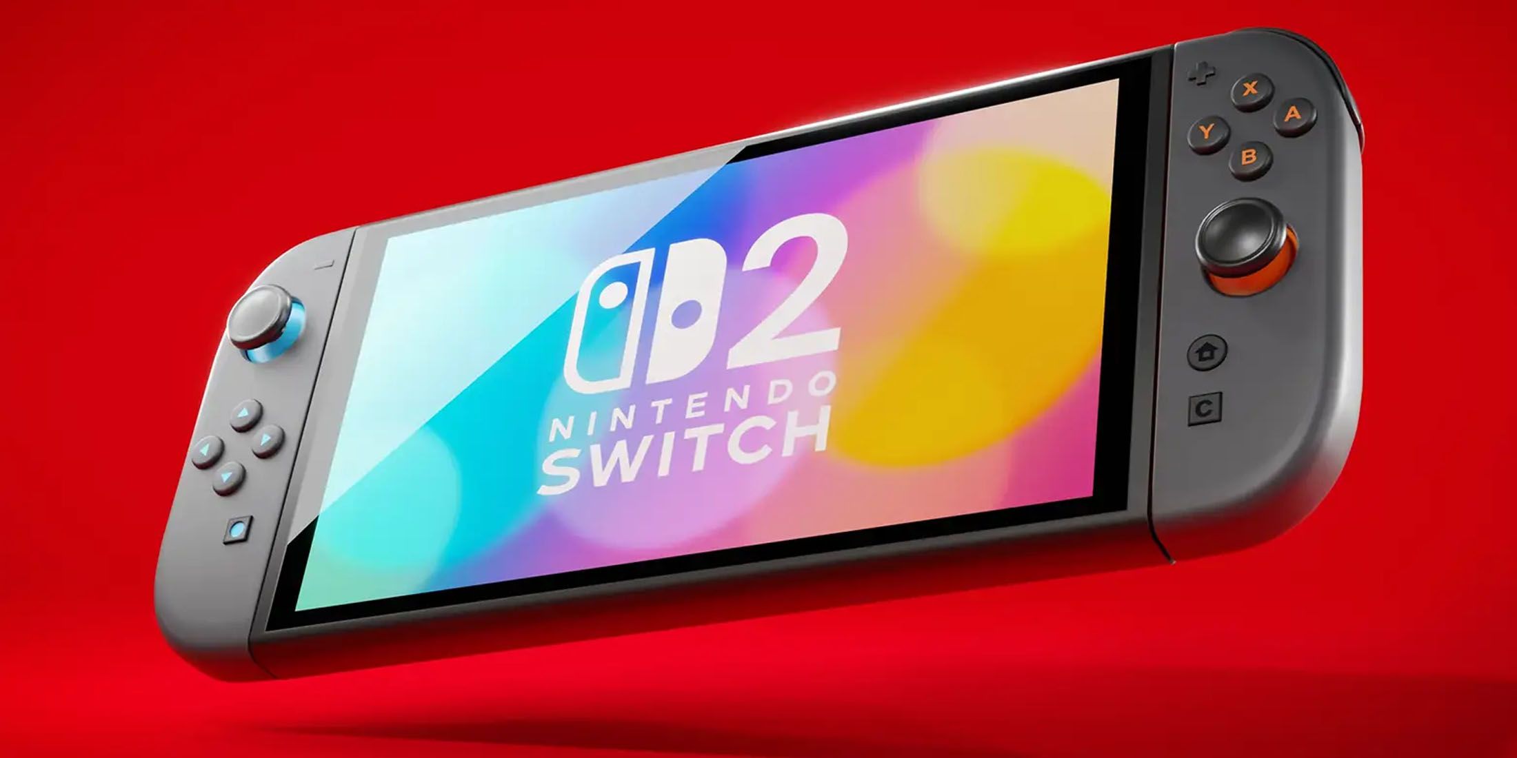
Nintendo Switch 2 Almost Had a Very Different Name
The Nintendo Switch 2 almost had a completely different name, one that would have referenced one of Nintendo’s classic gaming consoles.
People Aren’t Happy About The Nintendo Switch 2’s Boxes
Heading online after the April 3 Nintendo Direct revealed a lot of extra information about the Switch 2, its games, and its pricing, among other things, but sorting through these mixed details, no one could have predicted that the Switch 2’s game cases would cause a stir. It turns out that the Nintendo Switch 2 uses a different box art template than the original Switch, and disagreements about its quality have already begun. Some don’t mind the new design, and it’s evident that game art and logos aren’t suffering because of it, but it still sticks out like a sore thumb.
How Switch 2 Cover Art Rubs Some The Wrong Way
The main point of contention is that instead of the red and white Nintendo Switch logo occupying a small square at the top left, the red is now a case-wide banner with the Switch 2’s logo stuck in the middle. Furthermore, the game cases themselves may use red see-through plastic instead of the Switch 1’s light gray, meaning the right and bottom edges of the box art also sport a harsh red border. The borders may look more subdued when viewing an actual Switch 2 game case instead of a 2D render, but there’s no ignoring the new banner.
Nintendo Switch 2 Box Banners Are Distracting For An Important Reason
There Should Be No Confusing Switch 1 and 2 Boxes
Universal case templates involving banners, whether on top of a cover like with most PlayStation systems or on one side like a Nintendo DS case, have been a common sight across gaming for decades, but the Switch 2’s box art stands out even among those. Never before has a game box banner contained so much unused space, looked like it was dominating and surrounding an individual game’s artwork, and been so brightly colored. Debates about the Switch 2’s cover art will likely rage for a while, but there is a silver lining that will aid the console in the long run.
Because the Nintendo Switch 2’s banner looks so different from anything on Switch 1 boxes, and can potentially draw the eye away from a game’s own box art, not many people will mistake Nintendo Switch 2 game cases for their Switch 1 counterparts. Consumer confusion contributed to the rough transition from the Wii to the Wii U, and the two Switches have even more similar names and appearances. Keeping their boxes apart will help greatly, especially since not every game on one Switch is compatible with the other. It’s unorthodox, but this move is in the Nintendo Switch 2‘s best interest.




Leave a Reply