I’ve made no secret of the fact that I’ve been pretty burned out on triple-A games lately. They’re all increasingly starting to look the same. A lot of sequels barely iterate on their tried and tested formulas. Others iterate too much and lose the spirit fans love about them altogether. They’re too big, too disrespectful of my time, and too eager to nickel and dime me. I’m tired, guys.
But you know what I haven’t complained about yet? Menus. God, I’m tired of menu design in triple-A games. I’m tired of endless scrolling just to do the simplest of things, especially in Avowed. There has to be a better way.

I understand why menus might be tedious and complex. Games get more complicated year on year as developers try to cram as many cool mechanics as humanly possible into the experience, and all that information has to be represented somehow.
As they say, if it ain’t broke, don’t fix it. Using the menu format that everyone’s already used to gives players one less thing to adjust to, and relieves designers of the duty of finding a better way to make menus. There is nothing worse than an otherwise great game being bogged down by a menu system that tries to avoid approachability at every turn.

You know that meme about how every game is either a menu game or a parkour game? Menu games are less dependent on reaction times and more reliant on strategy and item use. Parkour games are more reliant on quick reaction times and tend to be less built for contemplative strategy. Obviously, this is a reductive binary, but that’s the fun of it. I play menu games – RPGs and such.
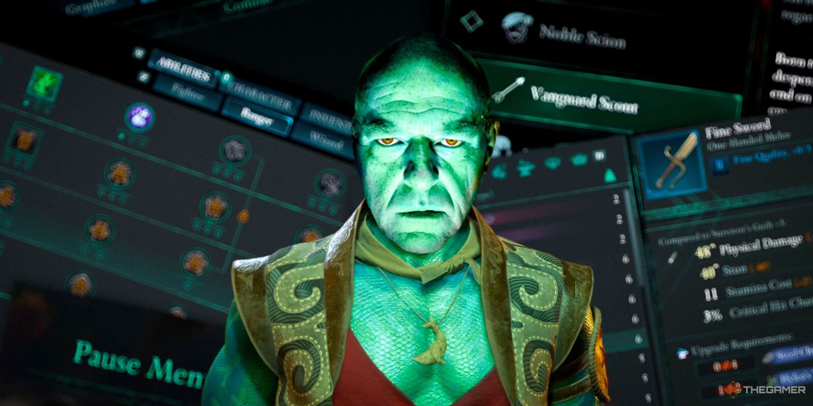
So when I talk about bloated menu systems, I’m mostly referring to RPGs. When you imagine an RPGs menu, what do you picture? There’s probably a journal tab, with multiple subsections separating main quests, side quests, and maybe collectibles. There’s an inventory tab with subsections for each item type. There’s a map, or more likely several, like a world map, city map, and maybe even maps for smaller areas like specific buildings.
Then there’s a tab for you to customise your character’s loadout. There’s one to customise their abilities, maybe even a second for skill point allocation. If you have multiple characters in your party to customise, you’ll probably have subsections for each of them, too. Avowed is a game reminiscent of old school RPGs, and therefore has an appropriately old school menu system. It’s driving me nuts.
It’s Not Just Avowed

I’m not entirely sure why this is the menu format we’ve defaulted to as an industry, especially when it’s so unwieldy on controllers. It’s easy to open specific menus with hotkeys when playing a game with a mouse and keyboard, but console players have to struggle to navigate with trigger and shoulder buttons, scrolling through huge lists of items with the joystick or D-pad, fighting the UI at every turn. I constantly move to the wrong menu when I’m trying to do something simple just because menu navigation is so unintuitive on the controller. It’s very annoying.
You could indeed chalk this up to me being stupid – I very well may be. But the problem extends past just Avowed. I can’t help but think of last year’s very good Metaphor: ReFantazio, which had absolutely gorgeous menus that made me want to cry. Yet another menu game, navigating between the many different menu options just to try and equip a different Archetype or change my loadout left me banging my head against the table. It shouldn’t be this hard to do a thing so simple… and yet.
An actor from Monster Hunter Wilds has also said she gets confused by the game’s menus. Menu games, man.

Menus aren’t something I think about unless they’re annoying me – that is, after all, the hallmark of good design. If you’re noticing something right off the bat, it’s probably because it’s annoying. I had to dig for examples of menu design that doesn’t upset me.
Resident Evil 4 is a good example of inventory management, specifically, made fun, while still keeping with the spirit of the game. You have to organise your inventory to fit within a set grid, turning the mechanic into a static game of Tetris, which can be borderline therapeutic for some more orderly-minded players. This method was inspired by System Shock 2, and has since been replicated in games like Dredge.
You can also more or less eliminate menus altogether. This is very obviously recency bias, considering I’ve just reviewed Wanderstop, but I liked the way it handled menus. Instead of giving you a single menu where everything is logged, it stored tutorials and tasks in a very navigable handbook. Inventory was managed separately through scrollable menus tagged to different buttons on the D-pad.
I would even say Borderlands 3’s menu is fairly easy to navigate, despite having quite a standard format. It has fewer tabs, represented by icons to save space, and the menus are laid out so there’s very little fiddling with trigger or shoulder buttons. There’s also Deathloop, which has somewhat convoluted menus, but logs information clearly (and dare I say beautifully), especially considering there’s so much information to take account of when planning your runs. It’s a more visual and spatial take on the quest log system that I appreciate.
Of course, my personal preference is predicated on the fact that I want clean, easy, accessible menus in my menu-heavy games. I don’t enjoy digging through menus to find items, and I don’t enjoy having to scroll through endless tabs. Some people do. Some people think Skyrim is the epitome of good menu design. More power to you if so. And some games want every mechanic to be full of friction because it simulates tension – more power to them, as well. That simply isn’t what I want.
I’m sick of big, hard to navigate menus. I’m sick of wrestling with pages and pages of information just to do simple things, and I’m especially sick of games that don’t take console players into consideration, especially since we have fewer controls to navigate menus with. We need to find a way to handle menus that isn’t a chore.


- Released
-
February 18, 2025
- ESRB
-
Mature 17+ // Blood and Gore, Strong Language, Violence