The Legend of Zelda has been nigh unstoppable over the past several years. Of course, Nintendo’s flagship adventure franchise has always clung to relevance and popularity, but its cultural significance seemed to be renewed upon the release of Breath of the Wild in 2017, and this dominance has only been solidified with recent releases like Tears of the Kingdom and Echoes of Wisdom.
One could (and many do) detail the myriad ways in which The Legend of Zelda has successfully retained its artistic value and consistent creative success, but these ends can be attributed to one guiding principle: experimentation. While other AAA IP often hitch themselves to an idea once it gains traction with audiences, Zelda never sets down roots, choosing instead to evolve with each entry. Through this philosophy, it’s able to stay ahead of, and often define, trends, rather than playing second-fiddle to other popular franchises. But experimentation can come with a cost, and in the case of modern Zelda, that cost is good UI and UX design.

Related
One Legend of Zelda Race Deserves a Second Chance to Make a First Impression
The Legend of Zelda franchise is home to many different races, but one has yet to return, and perhaps it’s time for it to be reintroduced.
Better UI Design Should Be a Priority for the Next Zelda Game
The Problems with UI Design in Echoes of Wisdom, Tears of the Kingdom
Nintendo was essentially starting from scratch with Breath of the Wild, reinventing the Zelda formula from the ground-up. One key pillar of this new formula was an inventory system, one closer to those in the action-RPG genre than the trim, focused, non-fungible item economy of prior games in the series. To organize the bevy of weapons, arrows, shields, and consumables that players would be tasked with collecting, Nintendo designed a fairly straightforward and stripped-back inventory management system, allowing players to swap through important items on-the-fly via a linear menu.
And for a game like Breath of the Wild, this system is adequate. But come Tears of the Kingdom, a game with a far more complex inventory management and crafting framework, and this linear menu’s helpfulness started to wane. Flipping through a linear menu on-the-go, even with the help of certain filters, can quickly become cumbersome and awkward when trying to piece together a multifaceted, complex piece of machinery.
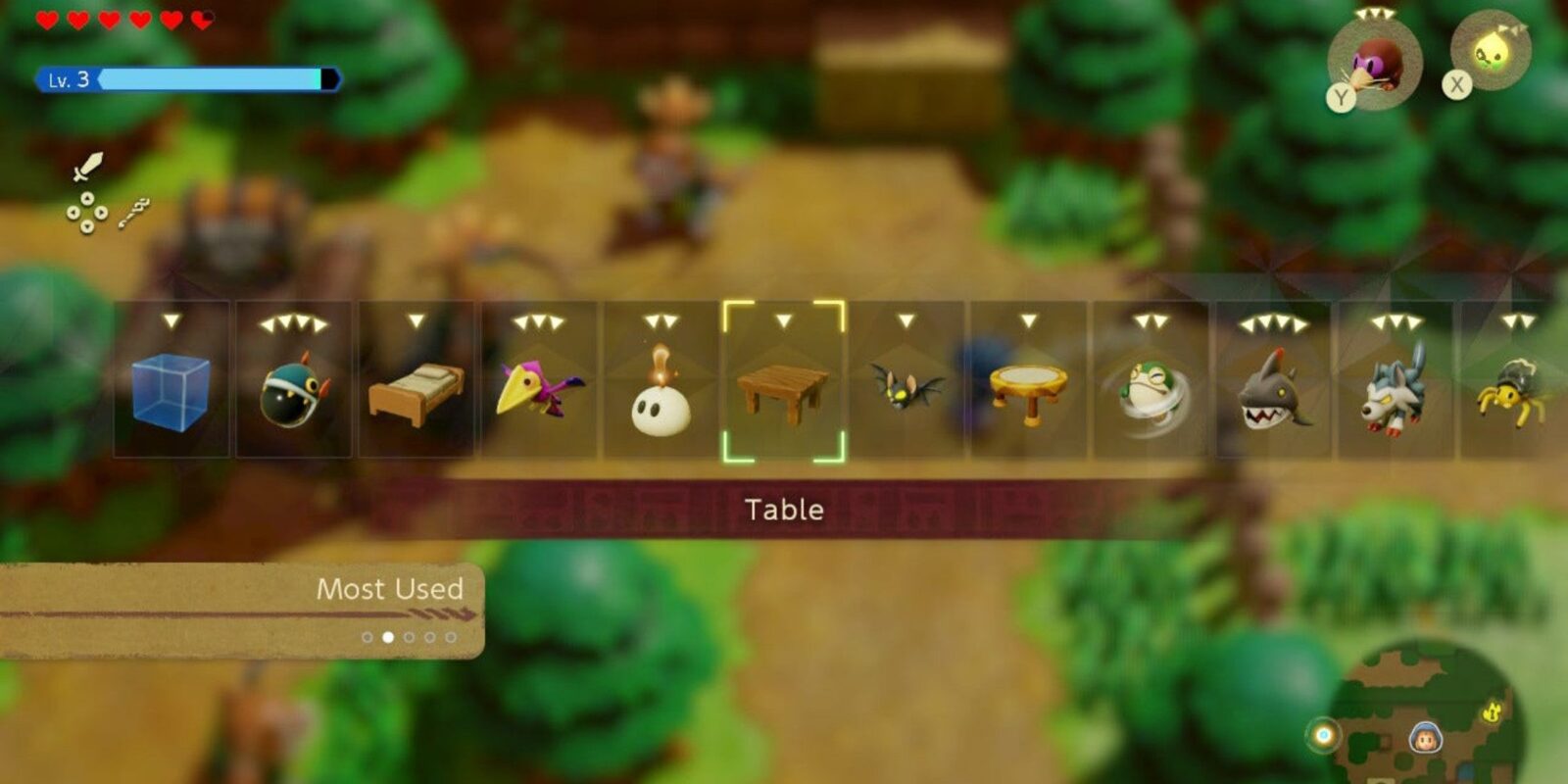
Echoes of Wisdom‘s UI woes are perhaps slightly less severe than Tears of the Kingdom’s, but it was the straw that broke the camel’s back for many players: Echoes saw the return of the linear menu, which doesn’t gel with its vast collection of Echoes. Puzzles in this game, more often than not, boil down to finding the correct Echo for the job, and when the task of finding said Echo involves flicking through an ever-growing list, it can start to feel a bit tiresome. Indeed, Echoes of Wisdom, like Tears of the Kingdom before it, involves quite a bit of repetitive menu-viewing, which can get old fast.
Points to Consider for the Next Zelda UI
Without knowing what the gameplay premise of the next Zelda game is, it’s hard to speculate about how its UI/UX design could be improved. After all, the next Zelda could revert to the old-school style of the franchise, walking back the robust item economy introduced in the likes of BOTW and TOTK.
But assuming the next Zelda game does have an inventory/item system comparable to these recent games, a more user-friendly shorthand interface will be essential. Perhaps a nuanced favorites feature, allowing players to easily assign shortcuts for specific items, would help with streamlining. This could take the form of a radial menu rather than a linear one, allowing for easier, quicker access. Aside from this player-controlled feature, better categorization, maybe structured around use case or some other practical factor, would make navigation, and general gameplay by extension, more intuitive.
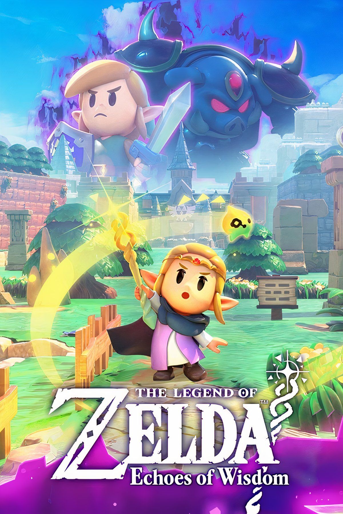
Save Hyrule—this time with the wisdom of Princess Zelda!
The people of Hyrule are being stolen away by strange rifts—and with a certain swordsman among the missing, it’s up to Princess Zelda to save her kingdom in the latest adventure in The Legend of Zelda™ series!
Team up with the ethereal creature Tri and use the Tri Rod to create “echoes,” which are imitations of things you find in the environment—then recreate those echoes whenever you like to solve puzzles and defeat enemies. Use echoes like water blocks to reach new heights, make bridges out of old beds, throw rocks at foes, or find your own combination of echoes to do things your way. You can even make echoes of monsters to fight at your side in combat!
- Released
-
September 26, 2024
- Publisher(s)
-
Nintendo
- Engine
-
Havok
- ESRB
-
E10+ For Everyone 10+
- How Long To Beat
-
20 Hours
- OpenCritic Rating
-
Mighty
Expand
Source link