Summary
- Roblox’s new blue logo has sparked mixed reactions among players on social media.
- Fans are divided on whether the change was necessary, with some comparing it to the Discord and Facebook logos.
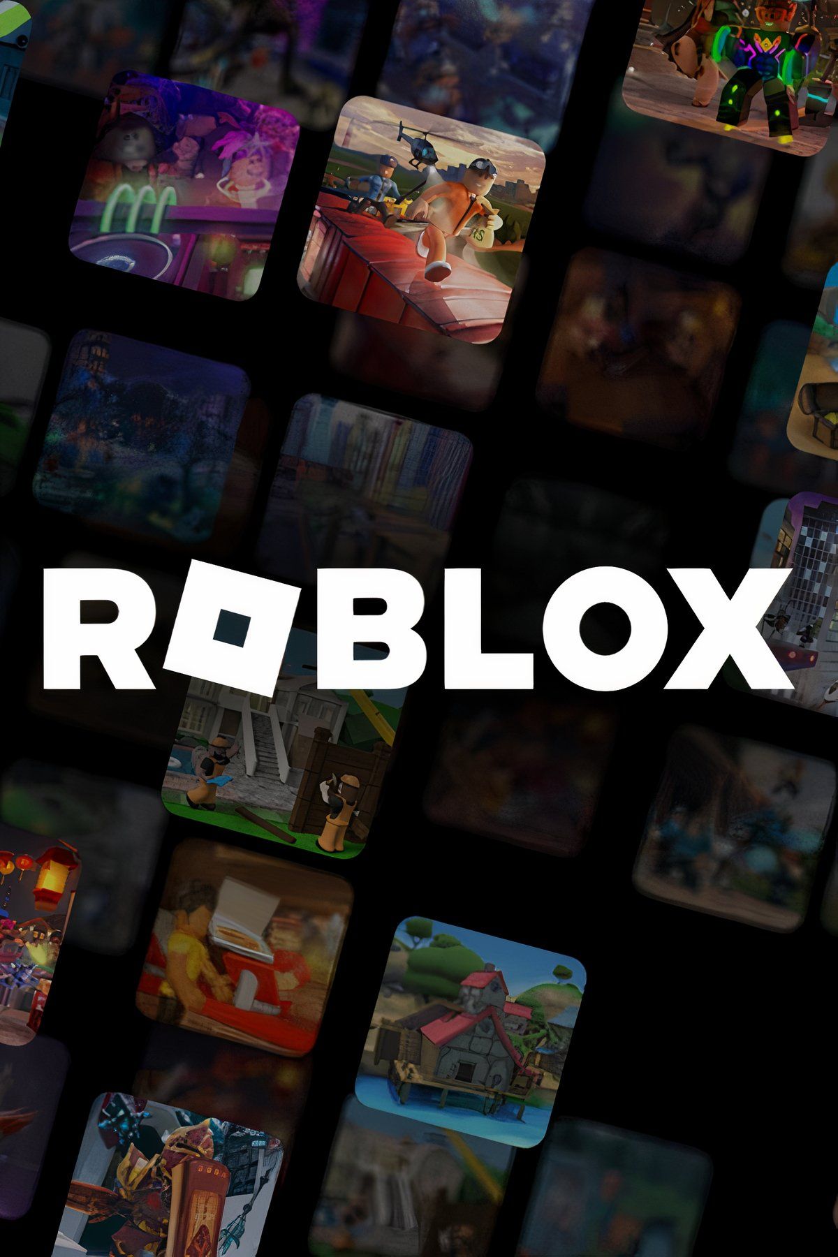
Roblox has recently changed its logo, swapping its sober black style for blue, and players can’t agree on whether this is a positive or negative update. The community quickly noticed Roblox’s logo change and flooded social media to discuss it.
Roblox has a huge community of players who interact with the platform to design and play games. Players can access a wide range of user-generated games in Roblox that span various genres and gameplay styles. The platform has evolved significantly since its first appearance on the gaming scene, and part of its evolution has impacted its logo. What began in 2004 with the word “Roblox” featuring different colors for each letter has undergone multiple transformations, the latest being a more sober black-and-gray design. However, the platform seems to have moved away from this design now, and players have things to say about it.
Related
MrBeast and Roblox CEO Team for TikTok Buyout Offer
Roblox CEO and MrBeast join forces for a buyout offer for the U.S. version of the hugely popular video-hosting app TikTok, but a long road lies ahead.
Many fans of Roblox’s games have taken to Reddit to discuss the new blue logo. Opinions range from players who feel it’s time for a change to fans who see the update as unnecessary. One player expressed dissatisfaction, pointing out that the new style makes it look like the Facebook logo, while others believe it’s slightly better, as the subtle purplish tint makes it look good. Many players were also a little upset that Roblox picked blue instead of red. One player even created a custom logo just like the blue one but in red, and others commented that it looked much better that way.
Players Are Divided Over Roblox’s New Blue Logo
A big part of the discussions centered around the new Roblox style being very similar to the Discord logo, with some even suggesting it was an intentional move. However, other players disagreed, commenting that the Discord logo is purple while Roblox’s is now blue, giving the brand a more “relaxed” look that they like. Players went back and forth on the topic, with opinions remaining pretty divided. Some of them simply don’t care, arguing that the change means nothing.
Apparently, not all players have been able to see the new logo yet, as many commented that they still have the black one. It’s unclear why the platform has moved away from its previous design or whether this is related to Roblox’s disappointing performance in Q4 2024. While players continue to discuss the platform’s logo, it remains to be seen if more changes will come to the platform moving forward.
- Released
-
September 1, 2006
- ESRB
-
T for Teen
- Developer(s)
-
Roblox Corporation
- Publisher(s)
-
Roblox Corporation






Leave a Reply