Summary
- Game Maker’s Toolkit redesigned Echoes selection UI in Zelda to address fan complaints.
- Fans want menus in the game to prioritize simplicity and convenience.
- GMTK presented four different redesigns for Echo selection, respecting the developers’ intent.
Game Maker’s Toolkit on YouTube redesigned the Echoes selection UI from The Legend of Zelda: Echoes of Wisdom to address complaints that fans had about its state in the official release. Although proud of these redesigns, GMTK stresses that he doesn’t believe these designs are truly “fixes,” emphasizing his respect for the choices made by the developers of Echoes of Wisdom.
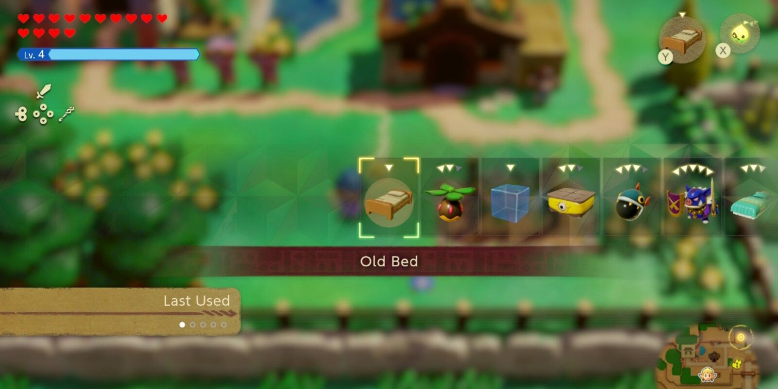
Fans have had issues about how item selection functions in Echoes of Wisdom, pointing to the single-line menu in the game as a repetition of a problem from Tears of the Kingdom that has persisted in following games. Players have voiced that they’d like their menus to prioritize simplicity and convenience in approach, championing a minimalistic design that meshes with the feel of the rest of the UI.

Related
Echoes of Wisdom’s Place on the Zelda Timeline Is Hopefully the Start of a Trend
With Echoes of Wisdom settling into one of the Zelda timeline’s official branches, it should start a new trend for the series’ lore moving forward.
YouTube channel Game Maker’s Toolkit published a video focused on “fixing” the UI for gameplay in The Legend of Zelda: Echoes of Wisdom by reorganizing how Echoes can be selected. To redesign the menus in Unity, GMTK went through the fandom wiki for The Legend of Zelda, collecting pictures of every Echo, then replicating the original menu UI from Echoes of Wisdom to establish a basic template. After that, he presented four different redesigns with some tweaks to the general experience. First, GMTK started by implementing acceleration within the Echo selection process so that the longer a player moves in any direction, the faster the selector sifts through Echoes.
The first redesign by Game Maker’s Toolkit was inspired by the XrossMediaBar from the PS3 era of PlayStation, starting with a horizontal menu to allow the selection of Echo Types, such as a Boomerang Boarblin, then creating a vertical menu for type and level selection. By simplifying Echo selection with this method, GMTK shaved the horizontal menu down from 100 to 55 Echoes. The next design is a grid with five tabs: one for objects, another for birds and ghosts, one for water and ice monsters, one for creatures, and finally, a tab for soldiers and similar beings.
Option three is a radial “favorites” menu, allowing for a ring of 16 items set from a menu so users can open it with one button and select their Echo by resting the joystick on their choice. GMTK noted that although this idea would satisfy plenty of fans, it’s not what the developers wanted the fans to experience. GMTK cited Echoes of Wisdom co-director Satoshi Terada, who wished for players to come across Echoes they’ve never used during the selection process and try them out for fun. To align with that vision, GMTK created a “spiral staircase” design menu inspired by Beyond Good and Evil‘s keyboard system, allowing players to use the radial design to scroll through all 100 Echoes with increased speed and freedom.


- Released
-
September 26, 2024
- ESRB
-
E10+ For Everyone 10+
- Publisher(s)
-
Nintendo