My Hero Academia has a very distinctive art style, incorporating a lot of color and vibrancy to help it stand out from its shonen competition, but nowhere can author Horikoshi’s artistic talents be seen more clearly than on the manga covers. These illustrations tend to give readers a sneak peek into the current events and characters that are involved within the story before they open up to the first page.
Related
My Hero Academia: Every Main Character’s Age, Height, And Birthday
My Hero Academia is made up of a dynamic cast of characters. Here’s everything you need to know about every major player.
On other occasions though, these covers are simply Horikoshi having a bit of fun by placing the series’ iconic characters in all sorts of weird and wacky scenarios. One thing is for sure though, Horikoshi knows exactly how to make a cover pop out from a page with his skills as an artist, and now that the story is finished, it’s time to take a look at which of the My Hero covers rank as the most eyecatching and memorable of them all.
8
Volume 21
A Cover Showcasing The Subtle Differences Between Hawks And Endeavor
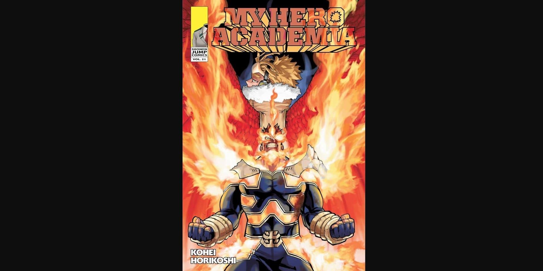
While Endeavor is introduced fairly early on in the story when he watches Todoroki from afar in the tournament, he plays a much bigger role later down the line where his character is built upon and expanded a little more. One character who has always admired Endeavor is Hawks, a fellow Pro-Hero who looked up to Endeavor from a young age, with the two of them appearing on this cover back to back.
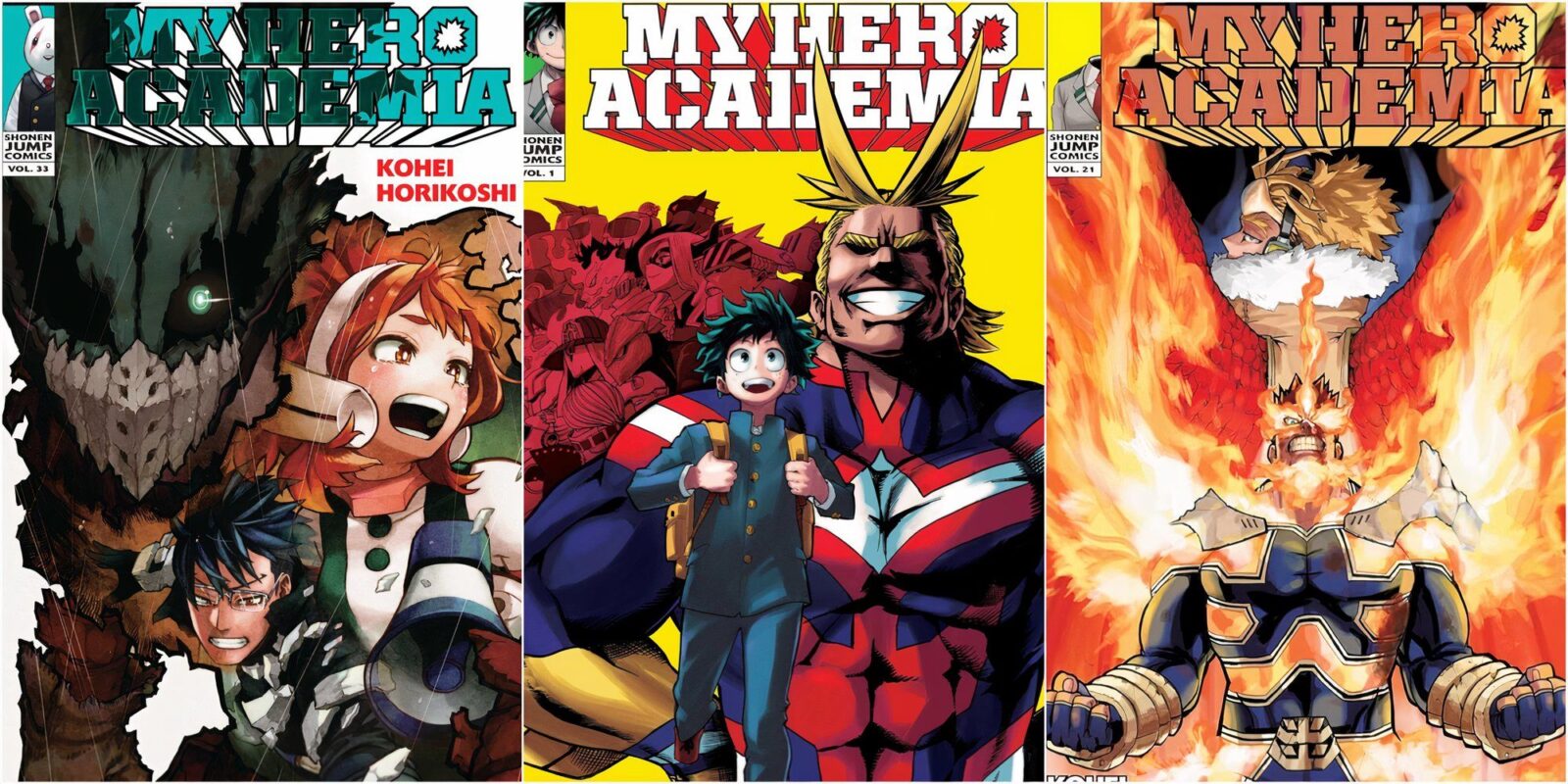
Through just this single image, fans can immediately distinguish what makes these two so different. While Endeavor is burning with rage as his flames surround his entire body, Hawks looks cool and calculated as his wings are amplified by the flames of his comrade. All of this results in a true feast for the eyes which also manages to feed into the characters and their personalities.
7
Volume 35
The Hero And Main Villain Of The Series Come Into Close Contact
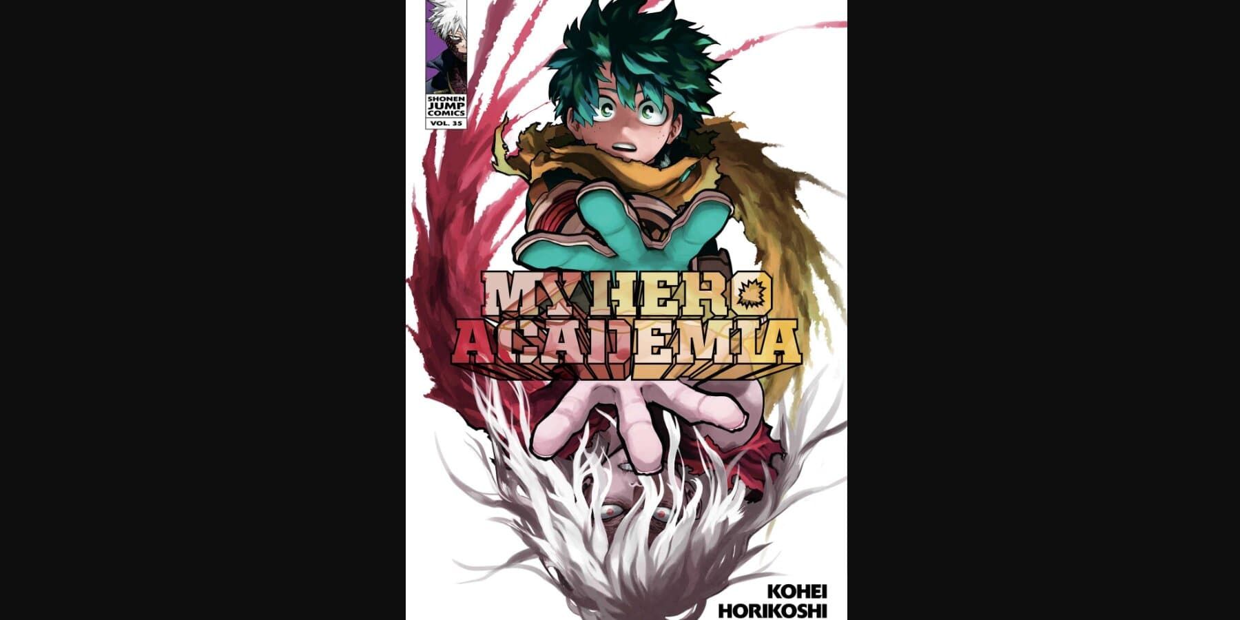
Simple but effective, Volume 35 features Deku and Shigaraki who seem to be reaching out for one another, while still being completely separated, both physically and emotionally. Considering this duo have been two of the major players of the My Hero story since it began, seeing them coming together for one of the final volumes in the series was a real treat for longtime fans.
Related
9 Best One Piece Manga Covers, Ranked
When it comes to manga covers, Eiichiro Oda certainly knows how to make them expressive, fun, and memorable.
There are also just a ton of small details here to admire, including the yellow and red swirls that linger around Deku and Shigaraki respectively, along with the shocked expressions on both of their faces, and the multicolored title. This cover feels like both a love letter to the fans and an artistic vision of the protagonist and villain all rolled into one.
6
Volume 33
A Haunting Cover That Suits the Darker Tone Of The Final Arcs
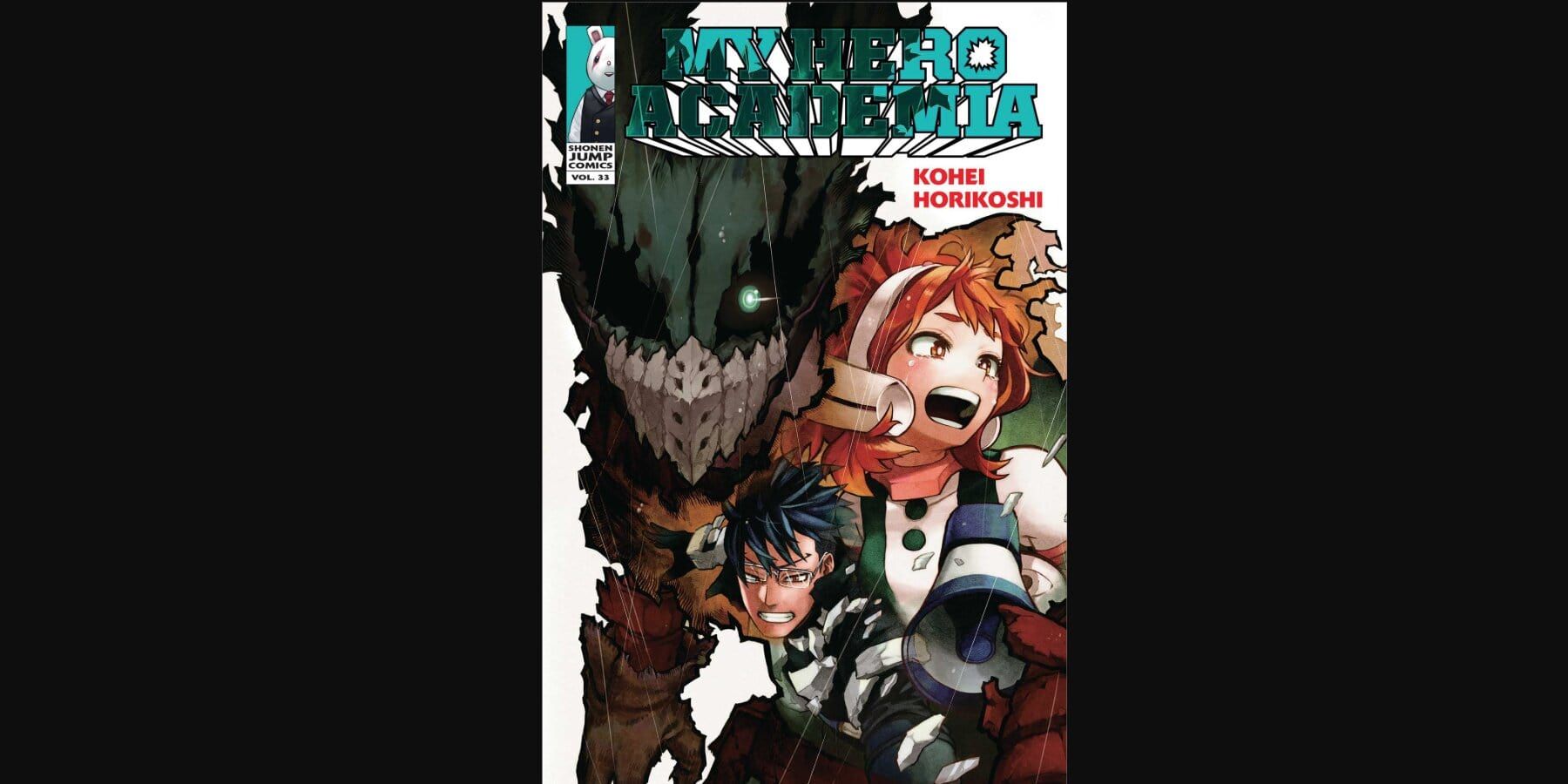
Over time, Horikoshi’s designs started becoming a little more realistic and moody, and with this came a darker tone for the series. This is reflected in the cover of Volume 33, which shows Deku, who at this point has gone rogue, sporting his worn-down and dirty vigilante costume, while Uraraka and Ida can be shown with their faces full of emotion. The way these two are merged into Deku’s costume is a clever way to highlight how much they mean to Deku at a time when he was fully prepared to let many of his friends go.
The small dashes of rain that cover the illustration also add to the darker aesthetic, especially when paired with Deku’s glowing green eye, which is lifelessly glaring at the reader. It’s one of the most haunting covers in My Hero, but one that is all so captivating to look at, and a real showcase of Horikoshi’s amazing character and costume designs.
5
Volume 8
A Vibrant And Colorful Homage To Classic Comic Book Covers
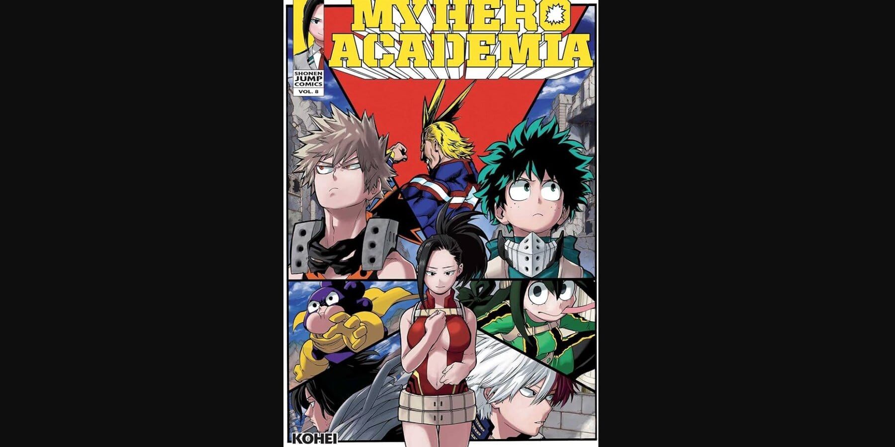
Probably Horikoshi’s biggest homage to the Marvel Comics is the cover of Volume 8, featuring multiple characters all separated into their own colorful strips while Momo can be seen in the center. The First Term Final Exam, which is covered in this volume of chapters, is a pretty stressful affair for many of the students, especially Momo, who begins to question her own usefulness after teaming up with Todoroki.
On the other hand, Deku and Bakugo have a pretty hard time trying to work together when going up against All Might, which is made very clear on this cover with the two of them ignoring each other while All Might stands high and mighty in the background. Being able to capture the emotions of so many characters with a single flashy cover is a testament to just how great of an artist Horikoshi really is.
4
Volume 24
This Cover Manages To Say So Much About Every League Of Villains Member
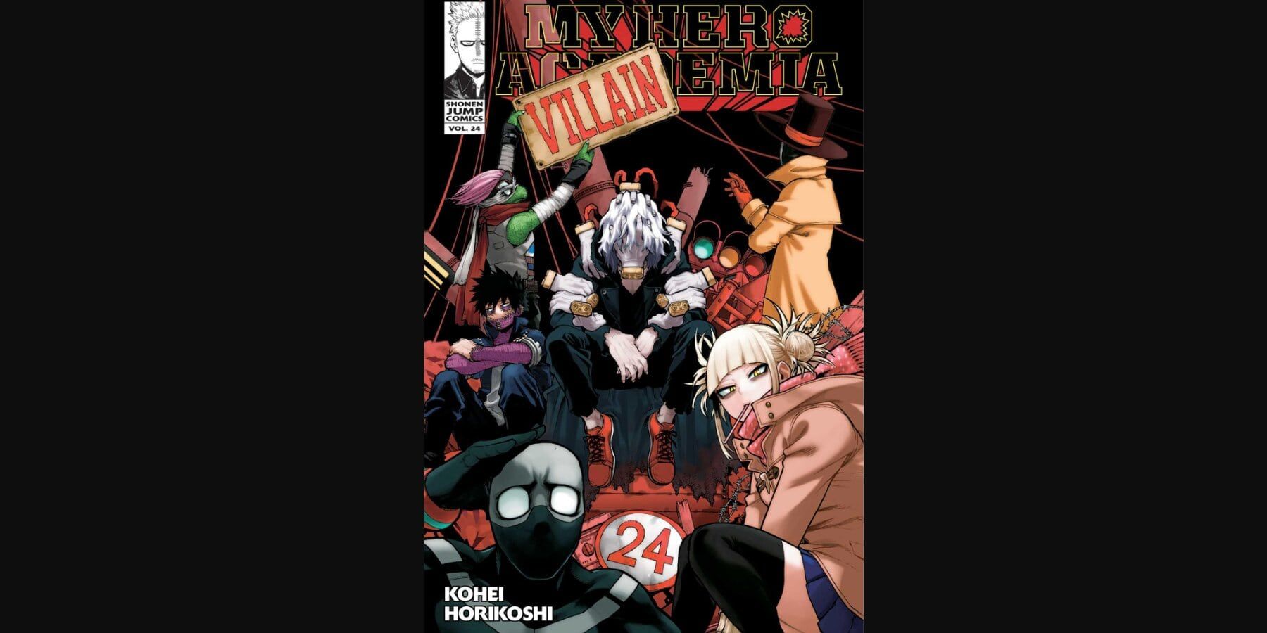
The League of Villains takes center stage in this cover to kick off their respective arc in the story, and it’s honestly remarkable just how much can be gleaned about this rag-tag group just by looking at them. Whether it’s the quiet and reserved Dabi sitting in the corner, the humorous Twice rubbing his head, or even just Toga looking coldly at the reader, there’s a ton of charm to this cover that comes from the varied expressions of each of the main villains.
Another neat little touch that takes this cover to the next level is the “Villain” sign being strung up to cover the original title, almost like a fourth wall break where the characters are playing against Horikoshi’s rules. Shigaraki may already be featured on several covers, but getting to see him and the whole gang in their natural habitat is still a memorable image that effortlessly conveys exactly who each of them are and what makes them distinct from one another.
3
Volume 25
An Eerie Illustration That Expresses Shigaraki’s Sadistic Personality
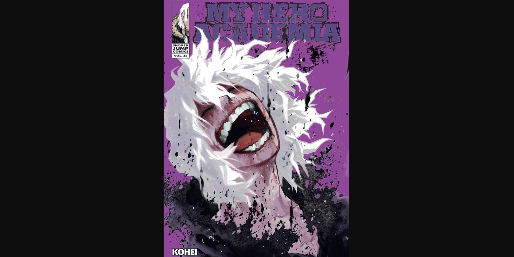
Shigaraki is one of the creepiest characters in the entire series, especially when his hand-mask is removed, exposing his twisted smile and facial expressions. Despite being very brash and even hotheaded at times, Shigaraki is still immensely powerful, and takes much joy in tearing down the society of heroes, as is expressed through his face on this iconic cover.
While the purple tint covering the entire page certainly helps to make it unique, it’s the sadistic look on Shigaraki’s face, paired with his shaggy white hair and devious smile, that make this cover stand out so much. Hirakoshi also decided to make it look like Shigaraki’s clothes were beginning to decay, probably as a subtle nod to his Quirk, and how it fits into his tragic backstory.
2
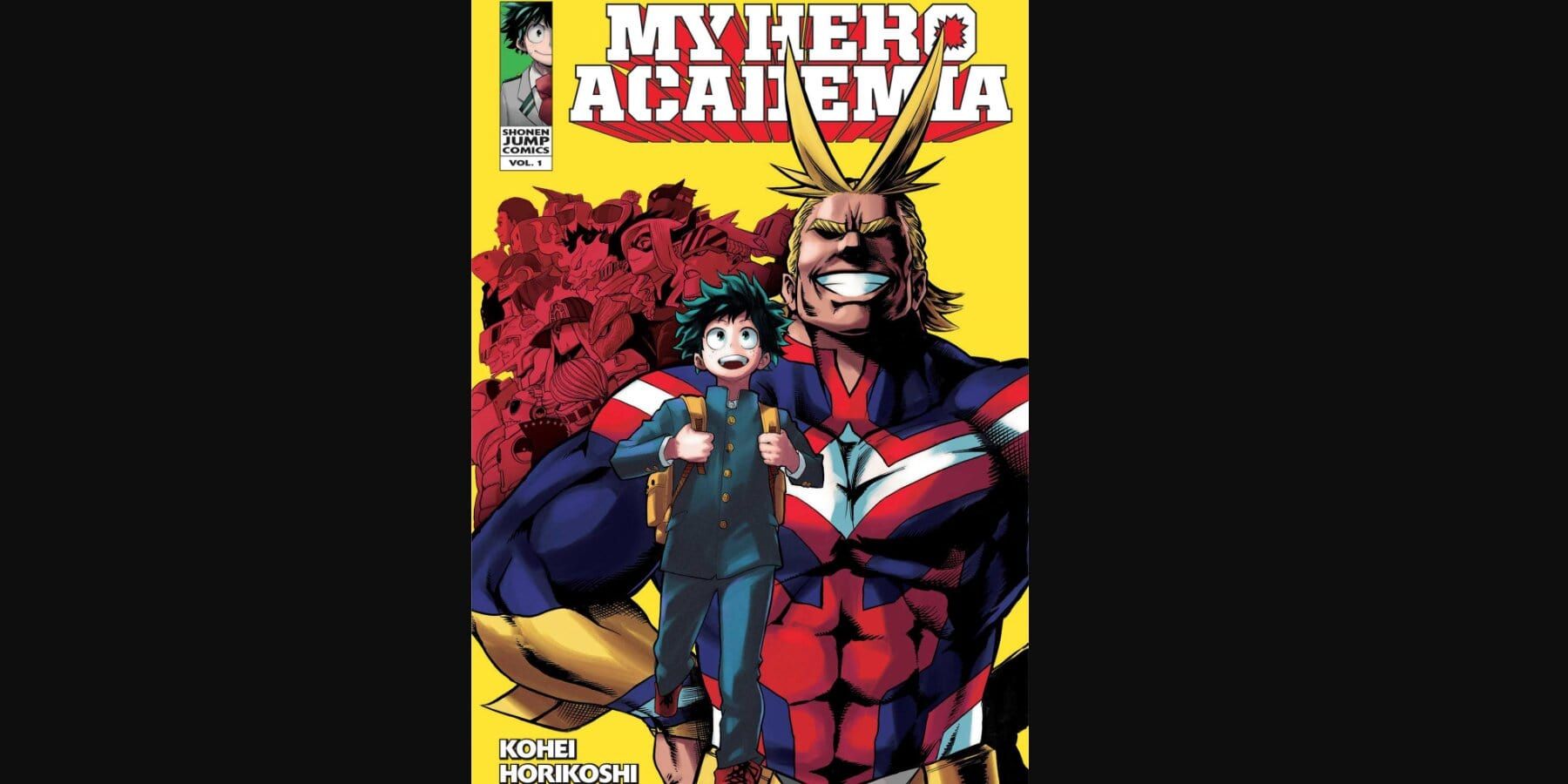
Volume 1
An All-Timer Which Even Non My Hero Academia Fans Can Recognize
Volume 1’s cover has become one of the most iconic covers in all of manga. The image of Deku walking ahead as All Might smiles ear to ear in the background is an illustration that has become synonymous with the series, but it also sets the stage for what’s to come too. Not only does it convey the vibrant and joyful tone of the early seasons, but showcasing multiple Pro-Heroes in the background also puts Horikoshi’s character designs on display, getting readers pumped for the adventure ahead and the characters they will be meeting along the way.
Related
9 Best Naruto Manga Covers, Ranked
These stunning Naruto manga covers gave readers a glimpse into the story they were about to dive into.
This cover would become so legendary, it would even be referenced in the final volume, which swaps All Might out for an older Deku. However, this volume cover still stands as one of the best in the series’ history, to the point where it has even convinced non-My Hero fans to pick it up just for the image alone.
1
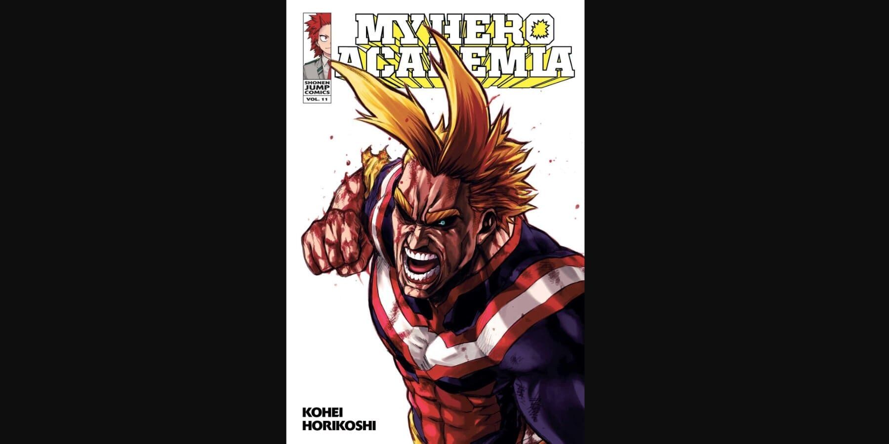
Volume 11
Horikoshi Puts His Incredible Character Designs On Full Display Through A Minimalistic Cover
This intense cover gives a rare view of All Might without his signature smile. Instead, he can be seen with a terrifying look on his face as he gears up for one of his immensely strong attacks, being clearly battered and bruised from his battle with a certain someone. This volume kicks off with All Might confronting All For One, which is arguably one of the most exciting parts of the entire series, so it seems fitting this cover would be as epic as it is.
The choice to completely remove the background also allows Horikoshi’s character designs to really stand out, especially the color coordination which allows All Might to look even more jawdropping. Overall, it’s a dazzling illustration that does a perfect job at highlighting just how high the stakes were for this epic duel between two arch-enemies.
- Release Date
-
April 3, 2016
- Japanese Title
-
Boku no Hero Academia
- Creator
-
Kōhei Horikoshi







Leave a Reply