Over eight decades since his first appearance in 1938, Superman continues to be a historical superhero who thrives in pop culture. The DC superhero has continued to be reinvented for each generation, whether it’s in comics, movies, TV shows, and video games. Among the numerous aspects that have changed is the iconic S symbol on his chest.
Related
Best DC Characters That Have Been Around For 80+ Years
Some of DC’s most famous superheroes and supervillains celebrate their 80+ anniversary, showcasing their immortal status as icons.
Truthfully, there are dozens of designs for the House Of El insignia ranging from the 1930s to today in various Superman stories. However, creators have gone the extra mile to create symbol designs that have been cemented as renowned pieces of Superman’s history by generations of fans.
10
Superman Beyond
A Mix Of Alien And Cyberpunk Aesthetics
- First Appearance: Batman Beyond Season 3, Episode 7
- Creator: Paul Dini, Alan Burnett, Rich Fogel
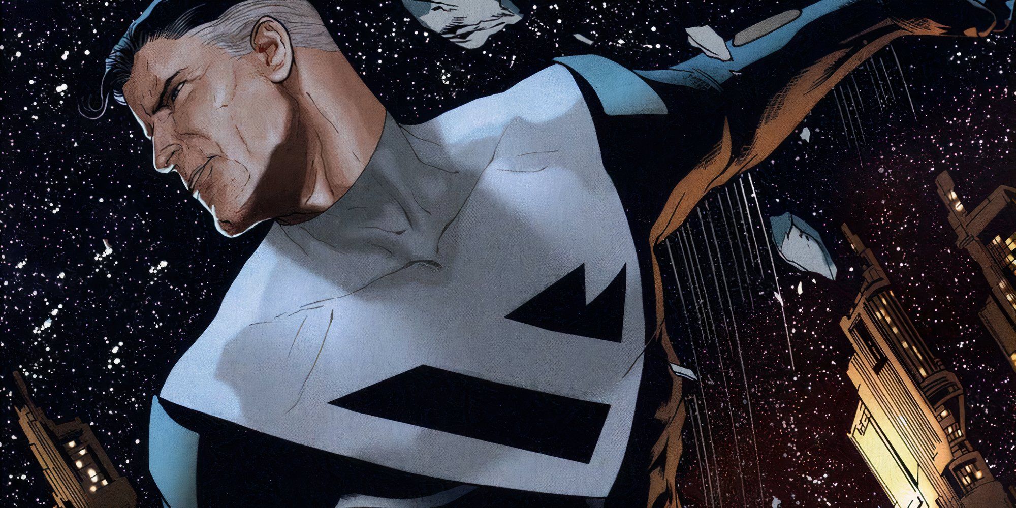
There have been multiple depictions of what Superman would look like in the future, given his slow aging process. Superman Beyond, in both animated and comic book form, shows that Superman ditches his red and blue tights as well as the cape entirely for a black suit with white accents.
Superman Beyond is more or less a fusion of the Kingdom Come suit and the Recovery Suit, featuring a thinner angular symbol that blends into the white shoulder portions of the suit. It’s sleek and futuristic, which fits the style of Batman Beyond, even if the S shape is a bit unrecognizable.
9
The New 52
New Symbol For A New Generation Of DC
- First Appearance: Justice League #1
- Creator: Geoff Johns, Jim Lee
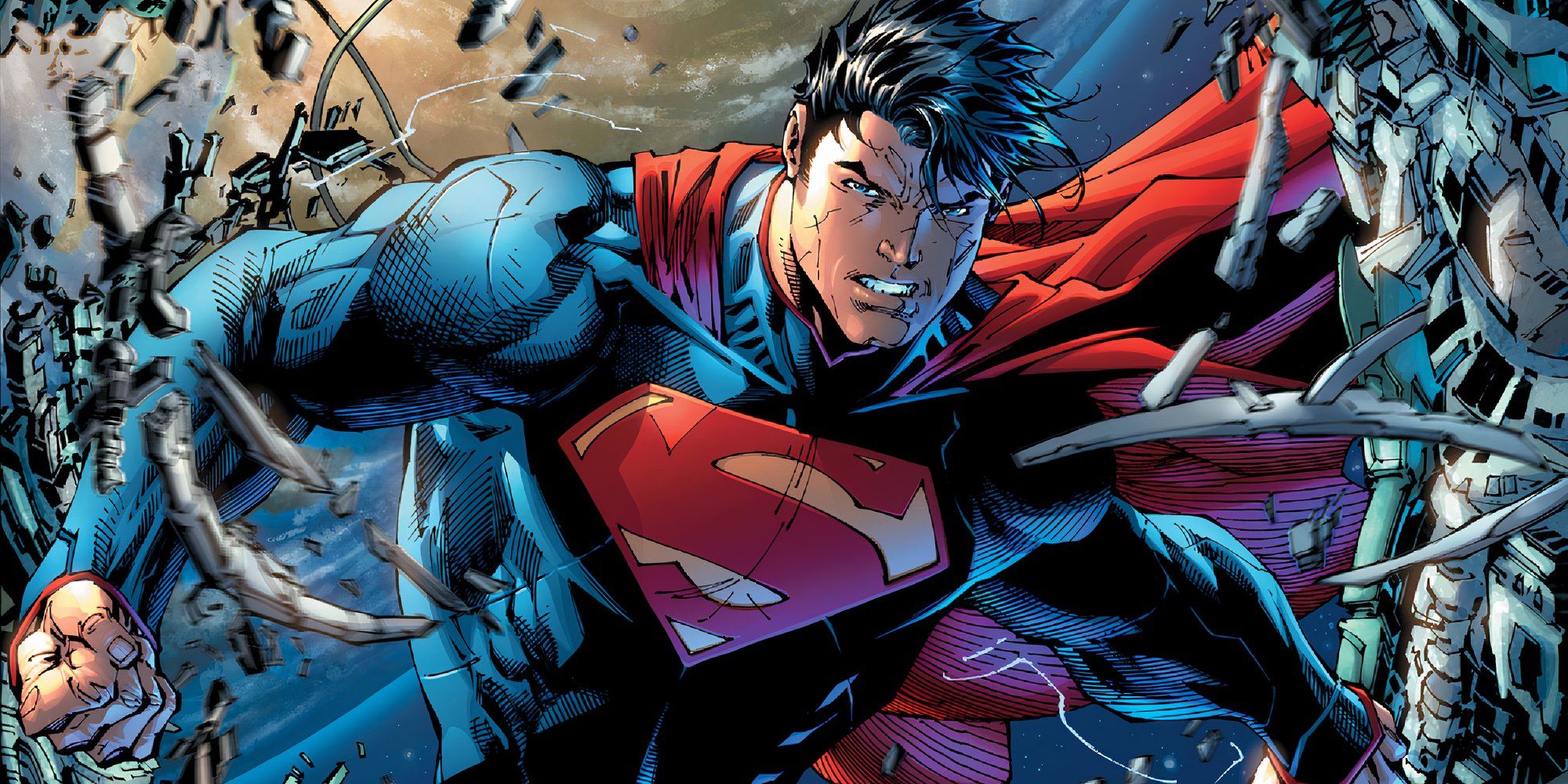
When DC rebooted entirely in 2011 with The New 52 era, nearly every character got a redesign, including Superman who debuted with the rest of his fellow Justice League members. His design was considered divisive overall, but his symbol stood out to the point that some character versions still use the appearance as inspiration.
The New 52 Superman suit put more focus on the alien side of his legacy. The symbol itself was heavily changed to look more like characters of an extraterrestrial alphabet. The curves are longer with more angular lines on the body of the crest, with a slightly metallic finish that matches the more armored style of the suit.
8
My Adventures With Superman
All Of Krypton Was Given An Emphasis On Angles
- First Appearance: My Adventures With Superman Season 1, Episode 1
- Creator: Studio Mir
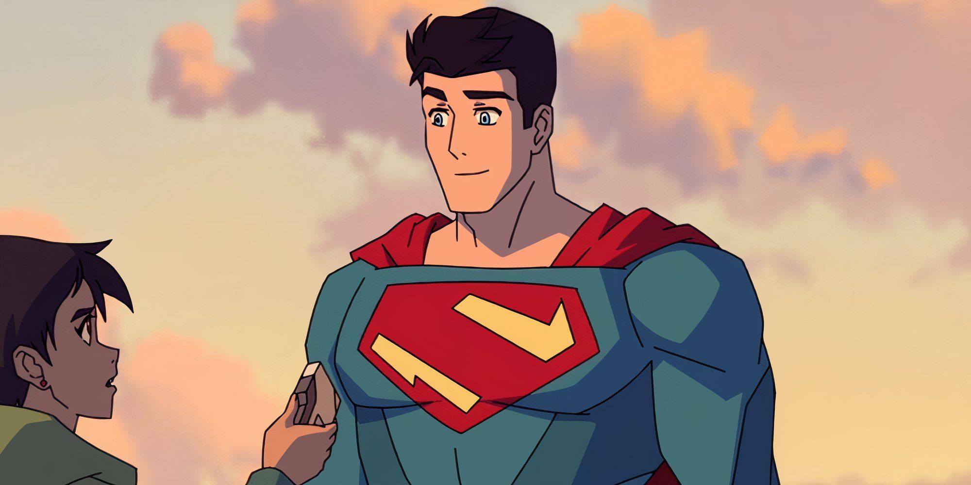
In My Adventures With Superman, now considered a top-tier Superman series, the Kryptonian styles and architecture are based almost entirely around angles, with lots of polygonal shapes for their technology, buildings, suits, and language. The symbol reflects that with a classic S-shape but without any of the curves it is known for.
The unique style of the symbol matches the suit, which also features many angles throughout its design. It not only helps My Adventures Of Superman maintain a unique identity but gives Superman and the House Of El a new aesthetic that is unlike any comics or previous shows.
7
Absolute Superman
The Man Of Tomorrow For A New Comic Universe
- First Appearance: Absolute Superman #1
- Creator: Jason Aaron, Rafa Sandoval
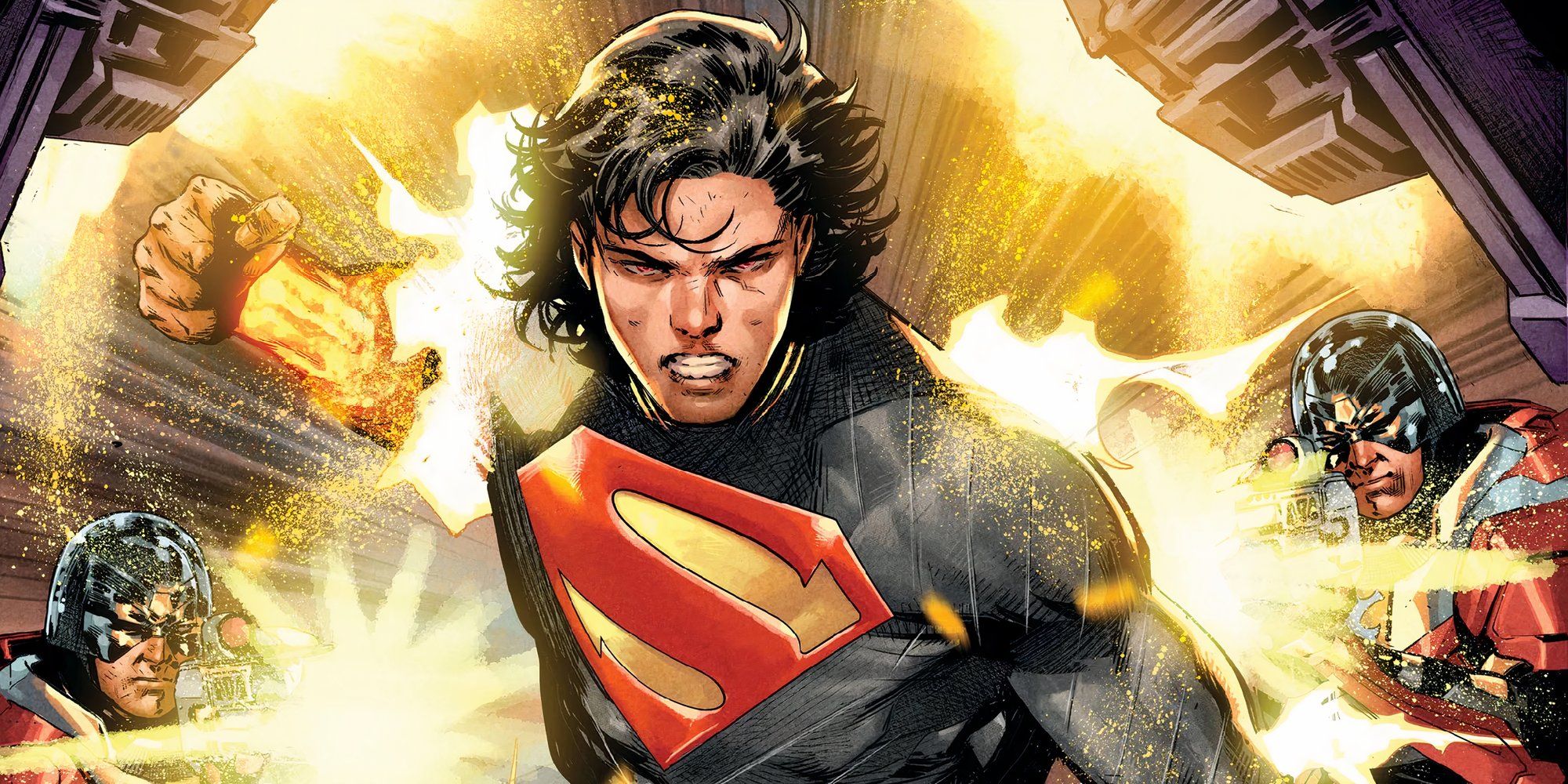
Superman through Elseworld stories is a common way to redesign a character, and that is the case with the recent Absolute Universe and Absolute Superman, which feature major changes. On top of the glowing bracers and boots, Superman sports a new crest that is mostly familiar to the classic look but with new sharp edges and points.
Related
DC: 9 Strongest Versions Of Superman, Ranked
Every version of Superman is powerful, but even with that in mind, these versions of the Man of Steel are a cut above the rest.
The symbol for Absolute Superman is an example of how simple changes can go a long way. The small tweaks to the symbol and the vibrant red are a stark contrast from the rest of the dark bodysuit but in a good way. The suit also features a pattern of lines that mirror the famous diamond shape of the symbol, helping it stand out.
6
Recovery Suit
Clark Came Back From The Dead In Style
- First Appearance: Action Comics #689
- Creator: Roger Stern, Jackson Guice, Denis Rodier
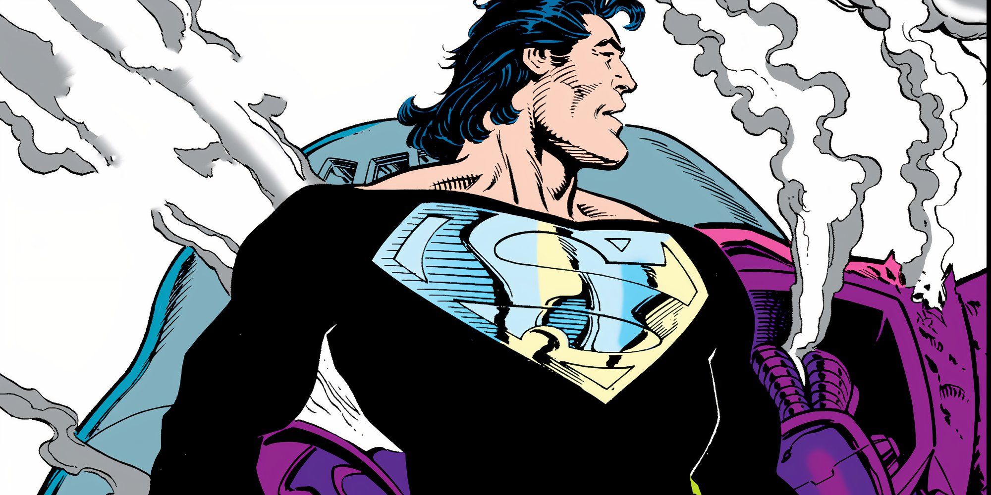
Often referred to as the Black Superman suit, the Recovery Suit is the temporary suit that Clark wore after returning from the grave in Reign Of The Supermen meant to aid his regeneration process. With it, came a classic symbol design, but with a chrome finish that spanned across his chest, with the top edge right of the border of the suit’s low neckline.
Given that Reign Of The Supermen was a darker storyline, the Recovery Suit fits the edgier version of a resurrected Superman, which became one of his most beloved suits. It’s bold and gives Superman a more imposing presence, almost like something an evil clone of Superman would wear.
5
Max Fleischer Superman
The First DC Animated Series Revolutionized The Symbol
- First Appearance: Superman (1941)
- Creator: Max Fleischer, Steve Muffatti, Frank Endres, George Germanetti, Myron Waldman, Willard Bowsky, Reuben Grossman, Orestes Calpini, Graham Place, Thomas Moore, Arnold Gillespie, Otto Feuer, Jimmy Davis, Nicholas Tafuri, William Henning, David Tendlar. H.C. Ellison
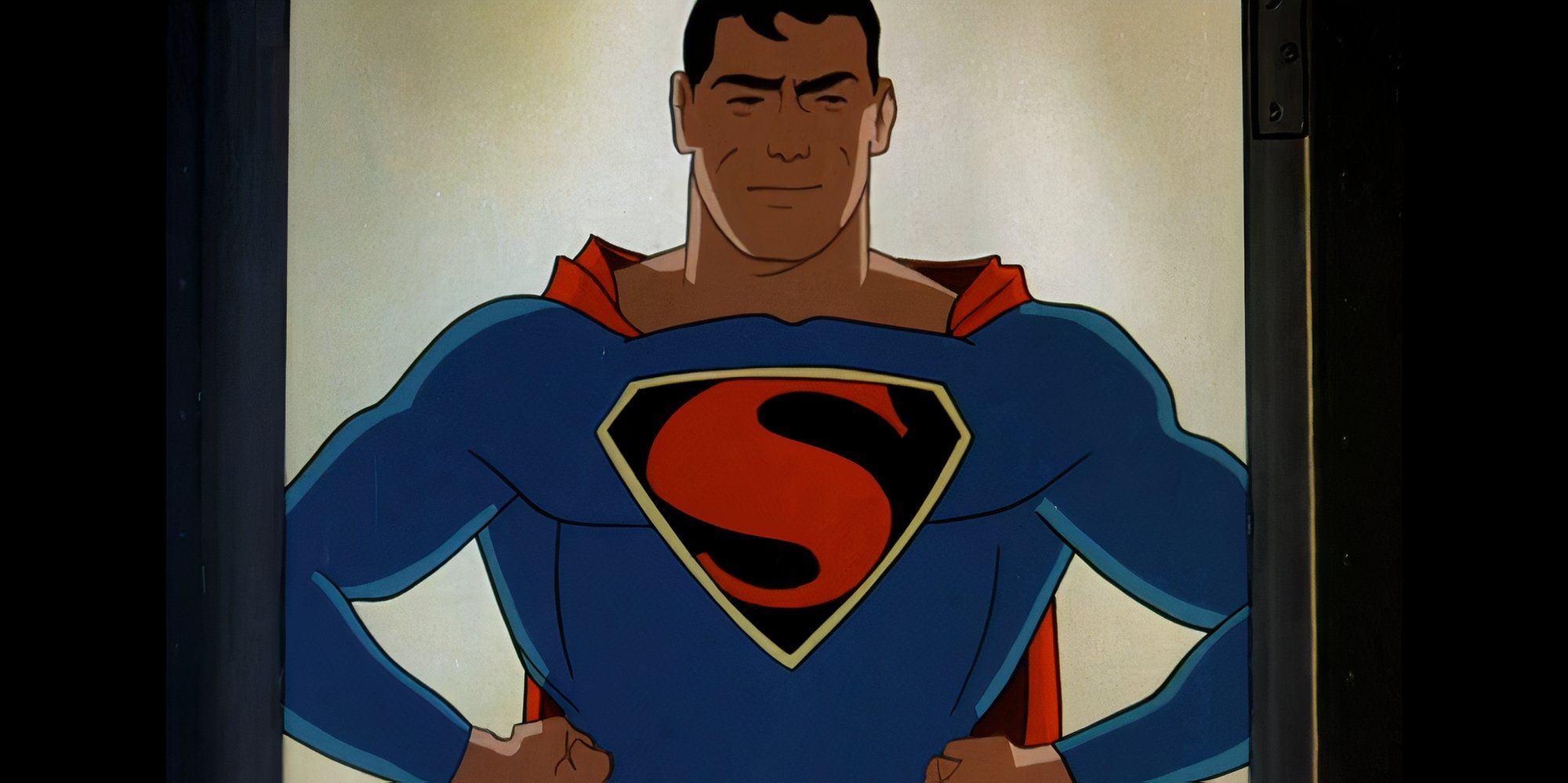
The Max Fleischer Superman cartoons from 1941 were pivotal in DC’s history. Not only was it the first animated DC animated series ever made, but it was the first time Superman’s symbol was depicted as a diamond shape. Ever since, Superman comics and movies have used that shape as the gold standard.
The black background with golden trim was taken from Superman #4 the previous year, but the symbol was given a more uniform shape compared to what had been seen in the comics. This symbol has gone on to inspire symbols in films and future comics, and was directly adapted in Superman & Lois.
4
Man Of Steel
Zack Snyder Crafted A Great Symbol To Match His Superman
- First Appearance: Man Of Steel
- Creator: Zack Snyder, Michael Wilkinson
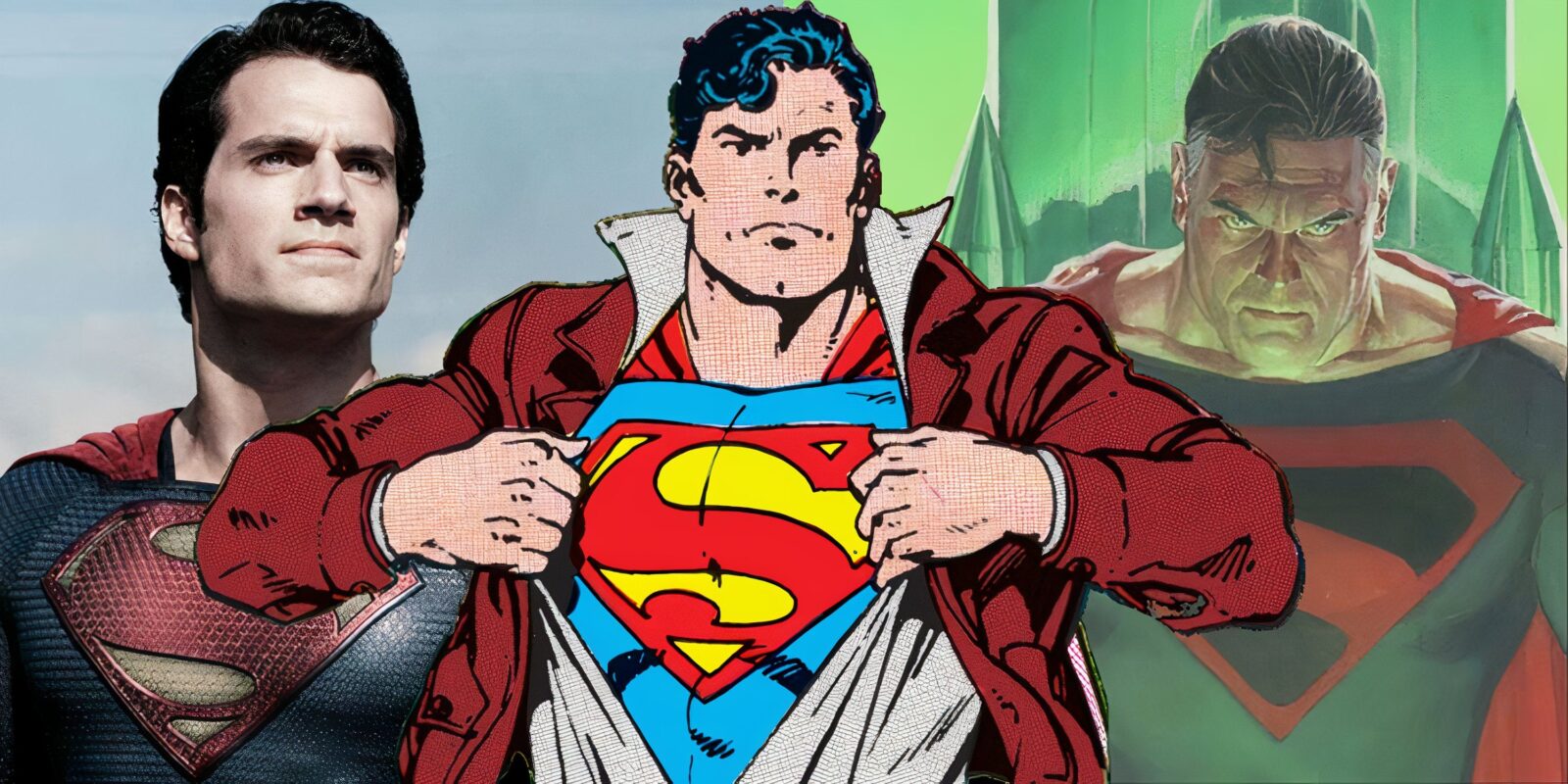
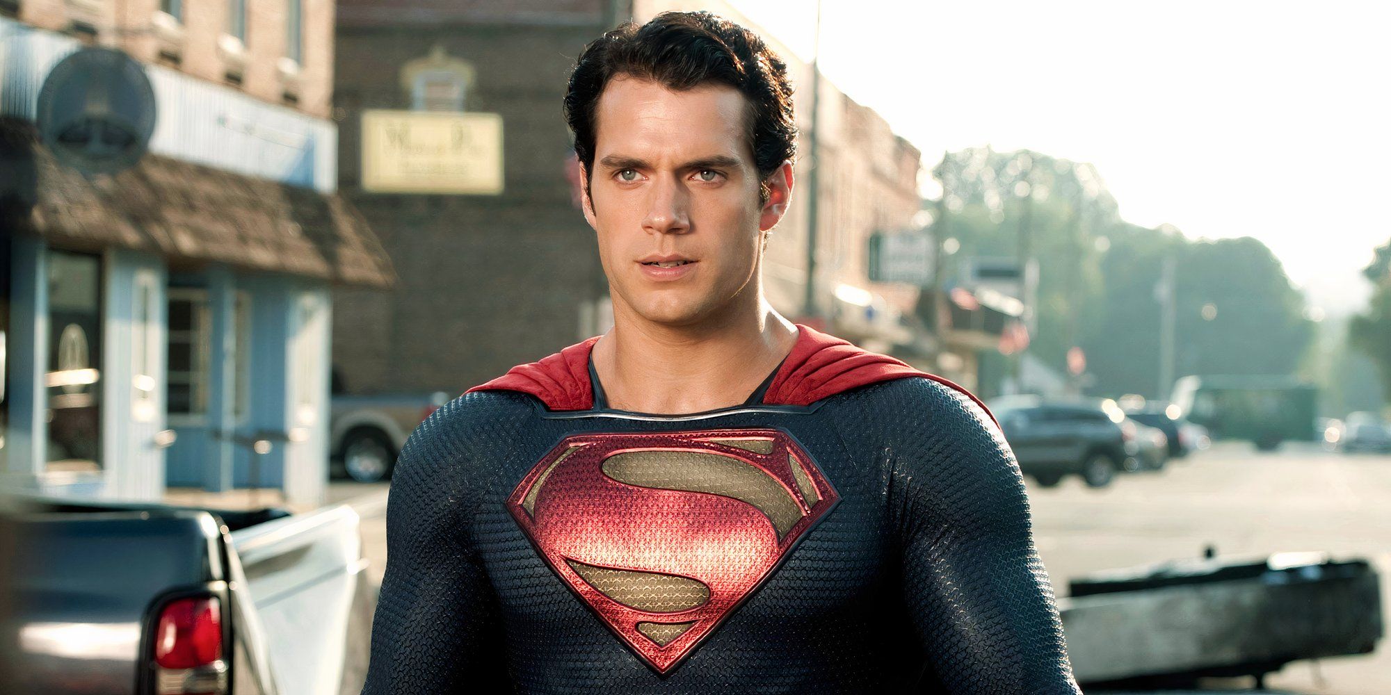
Man Of Steel takes everything about Superman and Kryptonian designs in its own direction, thanks to Zack Snyder’s vision. The symbol worn by Henry Cavill features an ornate yet bold glyph meant to look like the crest of a noble family, which is also why Henry Cavill’s suit is meant to resemble the chain mail of a knight.
Related
DCEU: 7 Characters Who Deserved Better
Some DCEU characters didn’t get enough time to shine as the true depictions that they could have been, or they were just killed too soon.
In future movies of the DC Extended Universe, the symbol was updated to feature more glyphs winding throughout the S symbol, but most fans agree that the original from Man Of Steel was Henry’s best. It was unique to his portrayal while still featuring a design that was still recognizable and iconic as a Superman suit.
3
The Shuster And Finger Symbol
The Definitive Superman Symbol That Inspires Hope
- First Appearance: Superman #26 (Vol. 1)
- Creator: Bill Finger, Joe Shuster
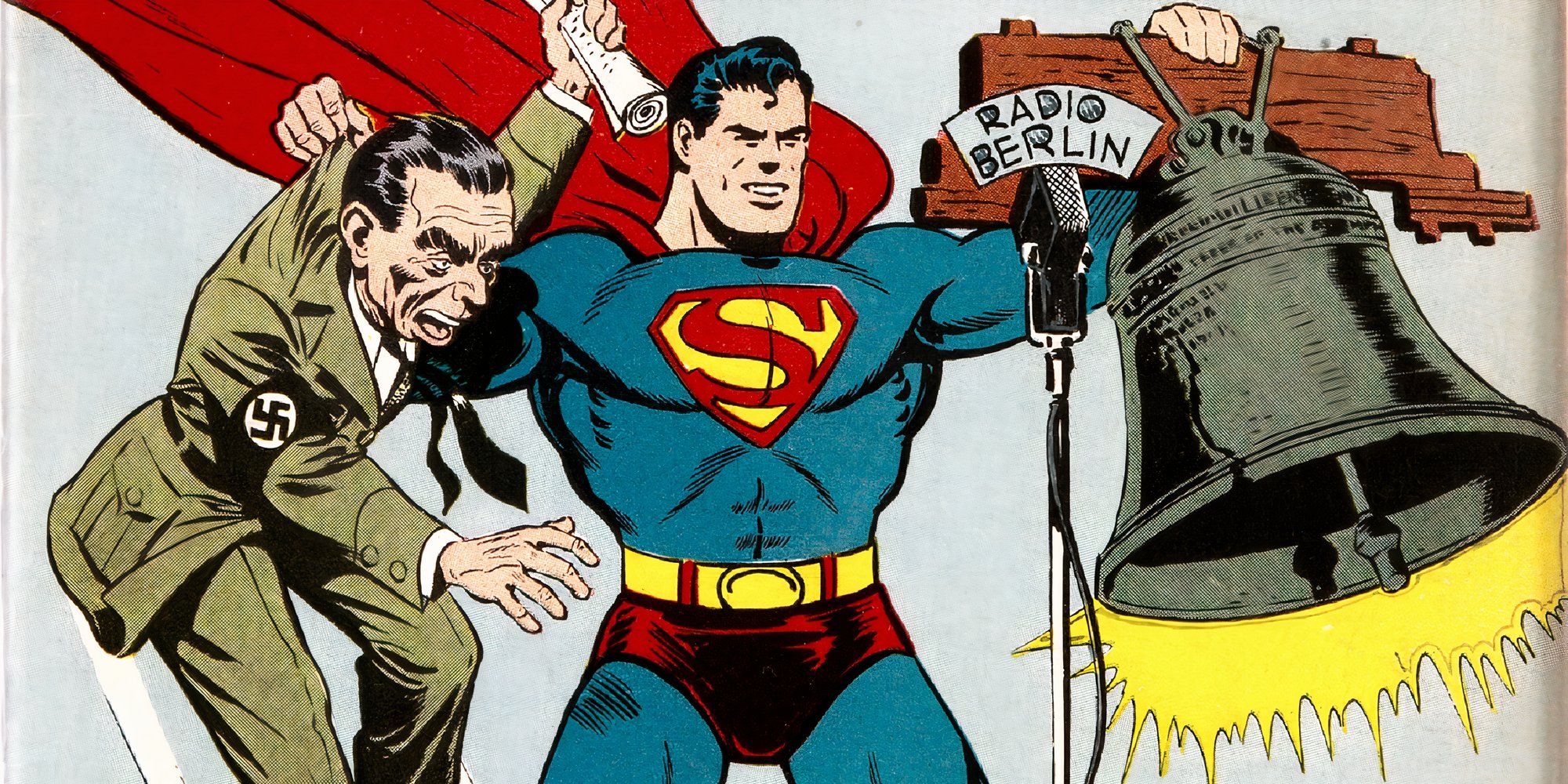
When people think of Superman, they think of the symbol that Christopher Reeve wore in his movies, which has been featured in various forms of entertainment. It first arrived in 1944 with Superman #26, five years after the character’s debut in comics, and DC has continued to use a variation of that symbol created by Superman’s co-creator Joe Shuster and famed Batman co-creator Bill Finger.
While comics and adaptations of DC continue to experiment with new designs, it always comes back to the 1944 symbol for Superman due to its impact on pop culture. In recent years, it was featured in the Injustice games and Superman & Lois, showing its longevity.
2
Kingdom Come
The Ideal Crest For An Elseworld Superman
- First Appearance: Kingdom Come
- Creator: Mark Waid, Alex Ross
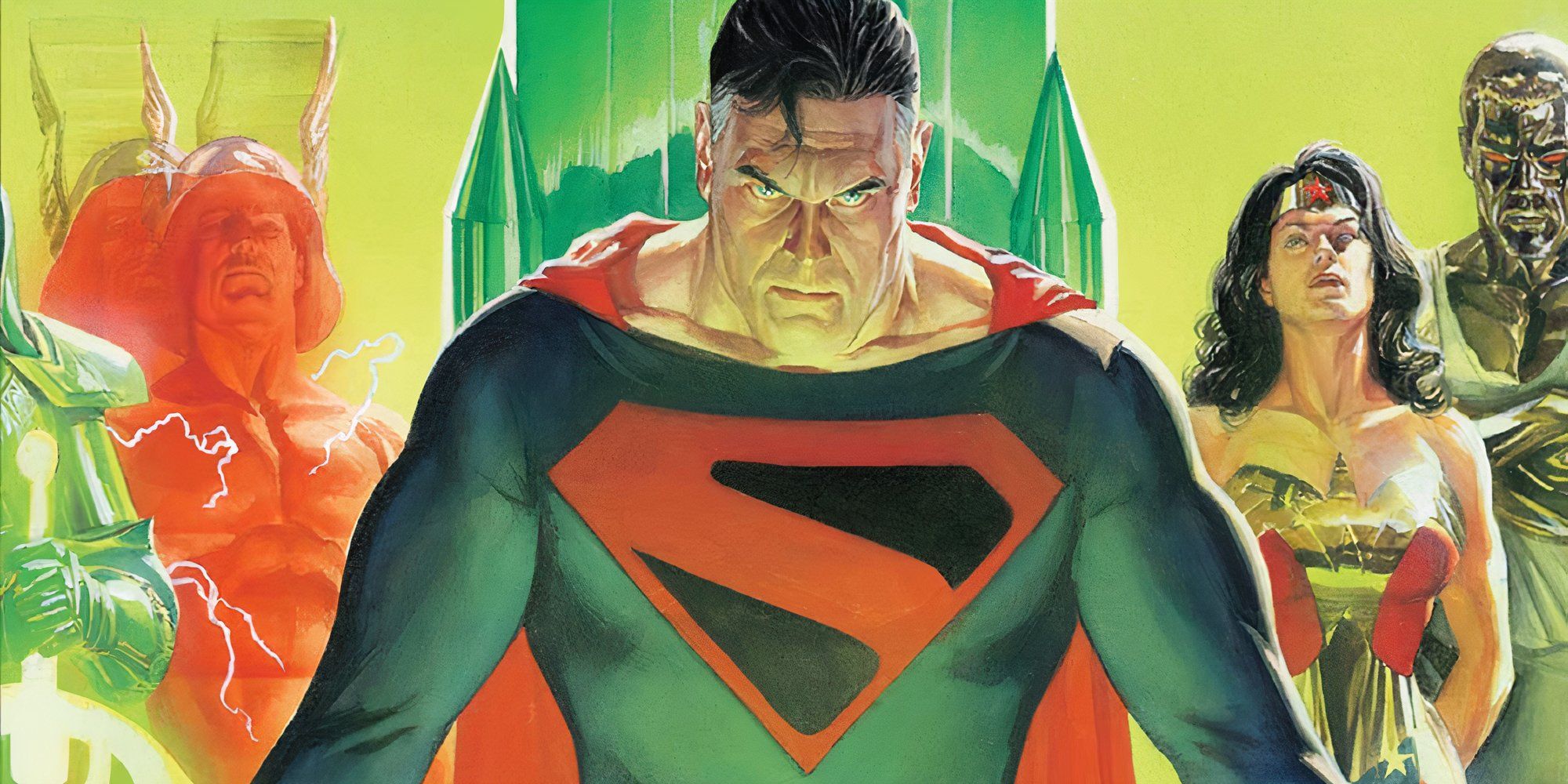
Part of what makes Kingdom Come one of the best Elseworld stories is the design. Alex Ross designed a very by-the-books suit for Superman but the symbol itself stood out, being one of the first to depict the famous crest as an angular alien emblem, which combined with an all-red and black color scheme allowed it to be distinguished.
Over the years, the Kingdom Come symbol has become a fan-favorite, often inspiring other similar angular designs like Superman Beyond. It was brought to life by Brandon Routh on the CW when he returned as Superman and is now the symbol used for David Corenswet’s version in the new DCU.
1
DC’s The New Frontier
Superman’s Design Went Back To The Classics And For The Better
- First Appearance: DC’s The New Frontier
- Creator: Darwyn Cooke
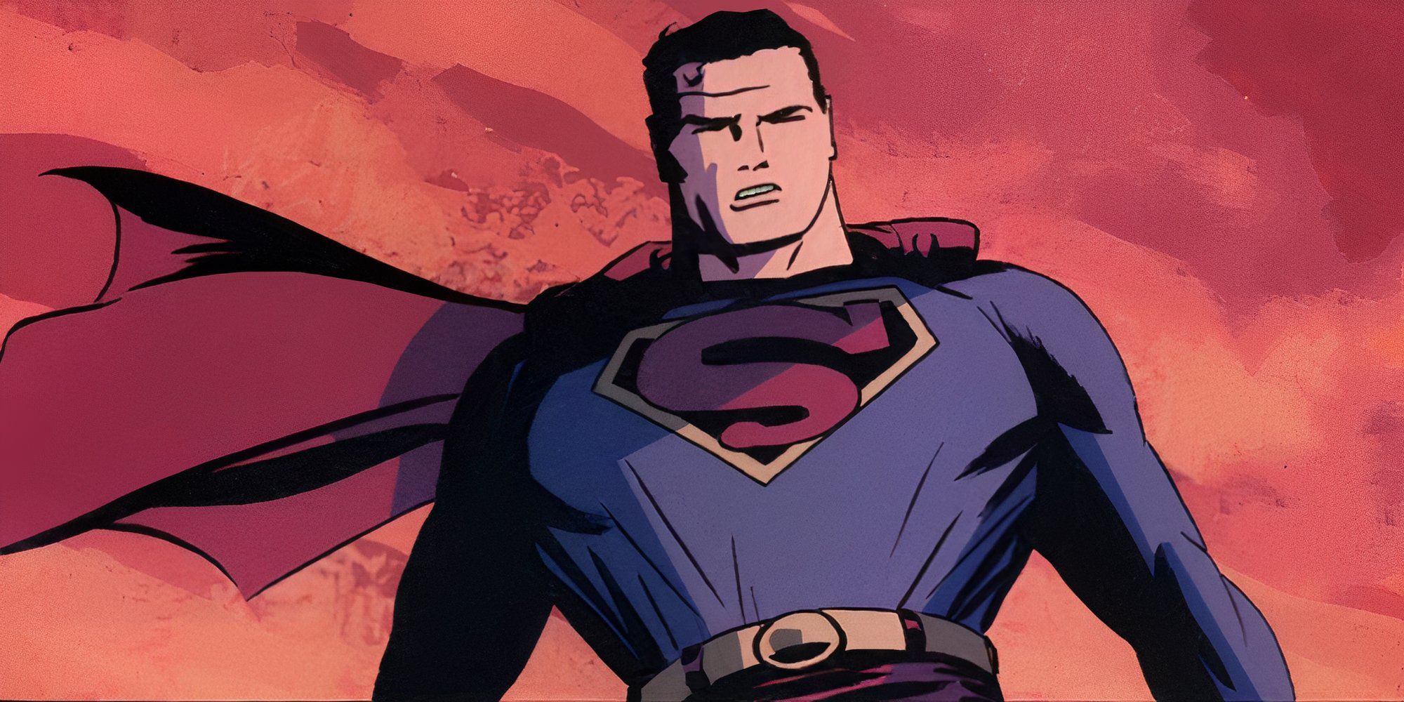
Darwyn Cooke created DC’s The New Frontier to be the ultimate love letter to the Golden Age and Silver Age of comics and Superman is the prime example of that. Not only does his suit match both eras, but the symbol takes the Max Fleischer-esque color scheme and puts it in a design closer to the 1944 symbol, resulting in one of Superman’s best designs.
Having the best of two worlds makes the logo stand out as iconic, but never looks or feels like a derivative. The black color of the symbol may not be what people think of when they imagine Superman, but when combined with the altruistic writing that Superman is given and a well-made suit, The New Frontier symbol has become a classic.
More
DC: Best Superman Comics For Beginners To Start With
Beginners hoping to jump into the world of Superman can do so easily by starting off with the following comic book series.


Leave a Reply