Summary
- Kubo’s manga covers focus on single characters in unique poses to emphasize personality.
- Bleach covers reflect Kubo’s evolving artwork and characters’ personalities effectively.
- Bleach covers showcase iconic characters with distinct styles and visual storytelling.
Tite Kubo, the author of Bleach, has a unique way of approaching his manga volume covers. Rather than packing them full of characters and designs, each cover will hone in on a single individual, presenting them in different poses and angles to help them stand out, along with featuring small details that help to define the character’s personality.

Related
Bleach: 8 Soul Reapers Who Never Used Bankai
For one reason or another, these Soul Reapers in Bleach never decided to unleash their Bankai, fueling much fan speculation on what they could be.
A cover can not only give a stylized view of a character, but it can also emphasize where the authors themselves are at in terms of their drawing style, which, for Kubo, has changed drastically over the years. When all is said and done though, these are the Bleach covers that stand out the most and have become the most memorable among fans.
9 Volume 13
An Imposing Introduction To The Character Of Zaraki Kenpachi
Kubo did a perfect job showcasing what Zaraki Kenpachi, the captain of Squad 11, is all about with this striking cover. By showing his imposing physical frame which takes up the whole page, paired with that devilish grin splashed across his his face, it allows readers to immediately understand that this is going to be one of Ichigo’s toughest opponents yet.
This was also one of the first times in a manga cover that Kubo began toying around with shading and lighting on his characters, making Kenpachi look all the more mysterious and eerily realistic. The title of the chapter “The Undead”, looking like it’s been stitched onto Kenpachi’s jacket, is the cherry on top for this dazzling manga cover.
8 Volume 35
Mayuri’s Weird And Creepy Persona Is Put On Full Display Here
Describing Mayuri Korutsuchi as an oddball would be a huge understatement, but this cover manages to replicate Mayuri’s weird and twisted persona in quite interesting ways. The most obvious feature of the cover is the fact that half of Mayuri’s face is off the page, while for the other half, his eye can be seen gleaming down at the ground while his mouth remains slightly open as if he’s amazed at the sight of a new corpse that he can experiment on.

Related
Bleach: 8 Characters With The Most Fights, Ranked
The Bleach series is packed full of exciting fights, but fans might be most familiar with seeing these characters clashing swords the most.
This also features arguably Mayuri’s most recognizable design in the series, which he wears through the Arrancar arc, and though it may seem minimalistic, there are clever details inserted here and there that paint quite a clear picture of who Mayuri is as a captain.
7 Volume 3
The Early Playfulness Of Bleach Is Summed Up Perfectly With Volume 3
In the early years of Bleach, before the characters started looking a lot more mature and realistic, there was a playfulness to the designs which could be seen most evidently with the main cast. A good example of this being put on full display is volume 3, which showcases Orihime lying down with her hair pressed up against a wall and a long ribbon stretching around her legs.
Not only does this cover provide readers with an immediate impression of who Orihime is as the fun-loving and creative member of the group, but it also feels as though Kubo had a lot of fun drawing it, especially with the title being written down the middle.
6 Volume 57
Byakuya’s Debut Cover Oozes Intensity And Style
Remarkably, Byakuya’s debut on a manga cover wouldn’t come until very late in the series, but it’s fair to say that it’s stunning to look at from a visual perspective. By this point in Bleach, Kubo had incorporated a much sharper and moodier look into his characters, which certainly applies to Byakuya here, who looks like he’s fighting for his life against the Sternritter As Nodt.
The small trails of blood stretching down from Byakuya’s head provide an intriguing contrast to the blue-themed hue that covers the rest of the page. The sheer amount of detail used for Byakuya’s Captain uniform and his blade also helps to push this cover to the next level.
5 Volume 60
A Solemn Portrait Which Shows Just How Much Can Be Said Through Facial Expressions
As mentioned previously, Kubo’s drawing style has evolved a lot since the beginning of the series, turning from a more outlandish and cartoony style to designs that have become more refined and realistic. A big benefit of this was that Kubo could convey emotions just from a character’s face, a perfect example of this being this minimal but effective cover that features Masaki, Ichigo’s mother.
Related
Bleach: 8 Biggest Changes Between The Manga And Anime
For the most part, the Bleach anime sticks closely to its manga inspiration, but there are some noticeable differences between the two depictions.
Despair, hope, regret, there’s so much that can be gleaned from Masaki’s face here as she stares up at the rain. This cover is a true testament to just how far Kubo’s drawing skills had come at this point, and it earns bonus points for featuring a character that many believed wouldn’t ever receive their own cover considering how little Masaki is shown in the story.
4 Volume 64
This Experimental Cover Feeds Into Gremmy’s Imaginative Powers
Very often, a Bleach manga cover will be able to say something about its character, especially if it’s their first introduction in that same volume of chapters. This especially applies to volume 64, which features Gremmy, a Sternritter capable of turning whatever he can imagine into reality.
As a result of his powers, Gremmy is a rather unusual and unorthodox character, which is made very clear here by the fact that his face is partly missing with the volume title intercepting his body. It’s a clever way to play around with the whole imagination-into-existence gimmick that Gremmy has going on and an eye-catching piece of experimentation from Kubo himself.
3 Volume 49
An Effortlessly Cool Look For Ichigo Which Showcased Kubo’s New Style For The Fullbring Arc
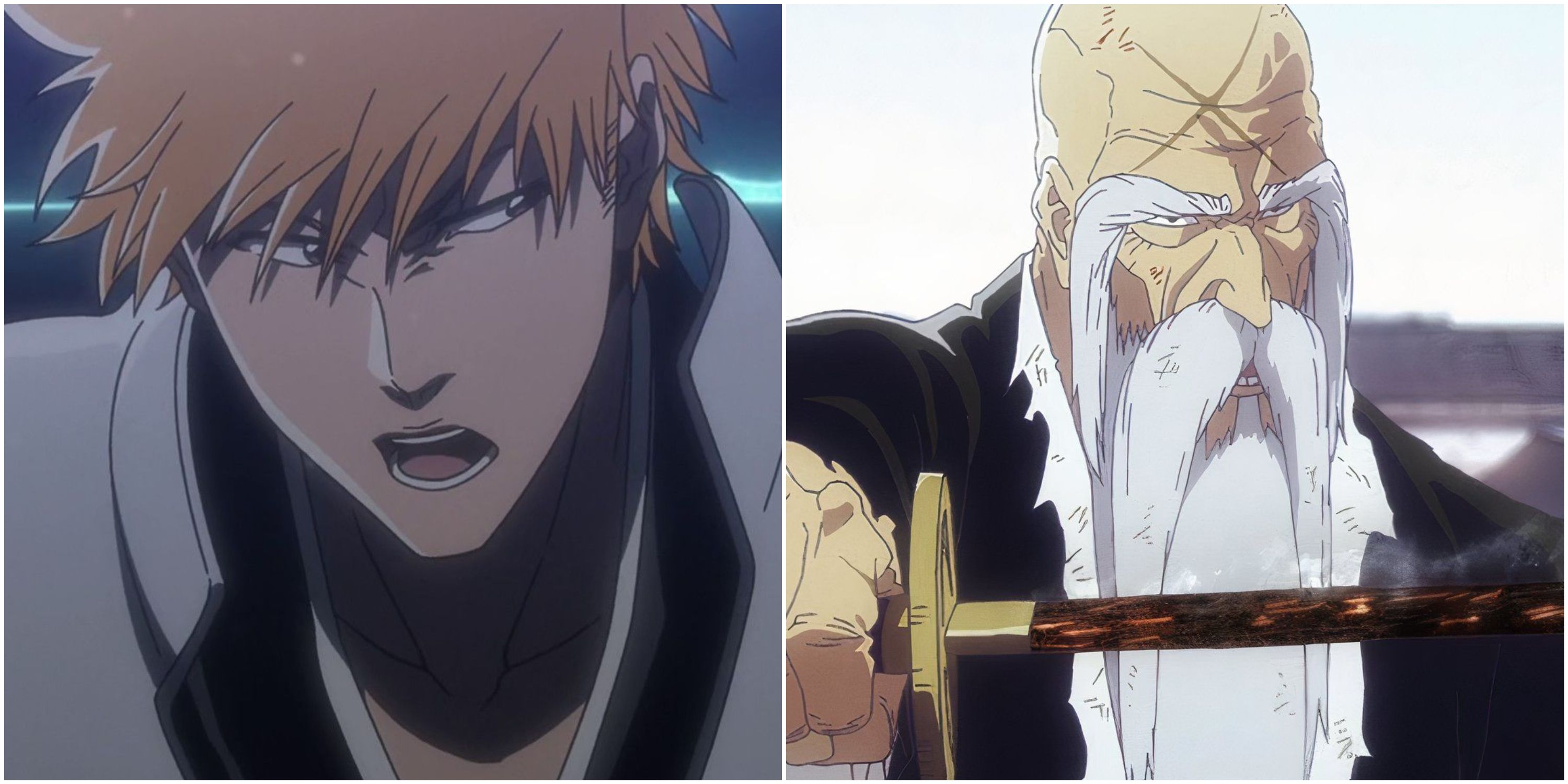
As the main protagonist of the series, Ichigo has appeared on numerous covers, but none are quite as stylish and jaw-dropping as this one. Many fans are aware that, in the Fullbring Arc, Kubo’s drawing style changed quite a bit as he began using much more shading and sharper features, alongside implementing more style into the clothing of his characters.
He made this new direction very clear with the very first volume of the entire arc, which showcases Ichigo wearing a white wooly jacket that covers a portion of his face. This is undoubtedly the best Ichigo has ever looked, with his effortlessly stylish fit and razor-sharp eyes all making him look like a true badass, resulting in one of the best covers in the series.
2 Volume 45
Never Has Yamamoto Looked More Intimidating Than Volume 45’s Cover
Despite being the strongest member of the Gotei 13, Captain Yamamoto can usually be seen sitting on the sidelines while his fellow captains do most of the work. However, it had always been made clear that Yamamoto was still a true force to be reckoned with, as is made evident by this outstanding manga cover which shows the captain staring down at the reader with a fearsome look on his face.
The use of shading here by Kubo is off the charts, with Yamamoto’s whole body looking like it’s being lit up by nearby flames, which feeds into his abilities. Additionally, his terrifying facial expression, along with all the scars covering his skin from years of battle, present him as a genuinely menacing foe who should never be taken lightly.
1 Volume 24
An Iconic Manga Cover That Feels Like It Pops Out From The Page
A cover so iconic that it has even been referenced in other manga like Jujutsu Kaisen, volume 24 marks the debut of Grimmjow, Ichigo’s self-appointed rival. Just like the man himself, this cover is a lot more brash and to the point than some of Bleach’s other covers, as Gimmjow reaches towards the reader as if he’s pulling them right into the story.
While his hand is the most noticeable part of the cover, this is also one of Grimmjow’s best designs to date. The bright blue eyes, wild hair, and free-flowing jacket all presented Grimmjow as a rough-around-the-edge punk-like character who was going to make his mark on the series, which just goes to show how much a single cover can say about a character.
Source link






Leave a Reply