Age of Empires Mobile brought the heavyweight IP to mobile devices this year, and that’s no small task. In particular, Age of Empires Mobile had its work truly cut out for itself in regard to its art, with the title going out of its way to push its platforms’ boundaries.
Age of Empires Mobile was released in October, at a time when historical strategy games are becoming all the more popular on mobile devices. In an increasingly competitive space, art is a key asset when it comes to standing out—not to mention how much the art of such games must carry the weight of real history. To better understand AoEM‘s approach here, Game Rant sat down with the game’s art team for some questions on art direction, technical challenges, and historical accuracy.
Related
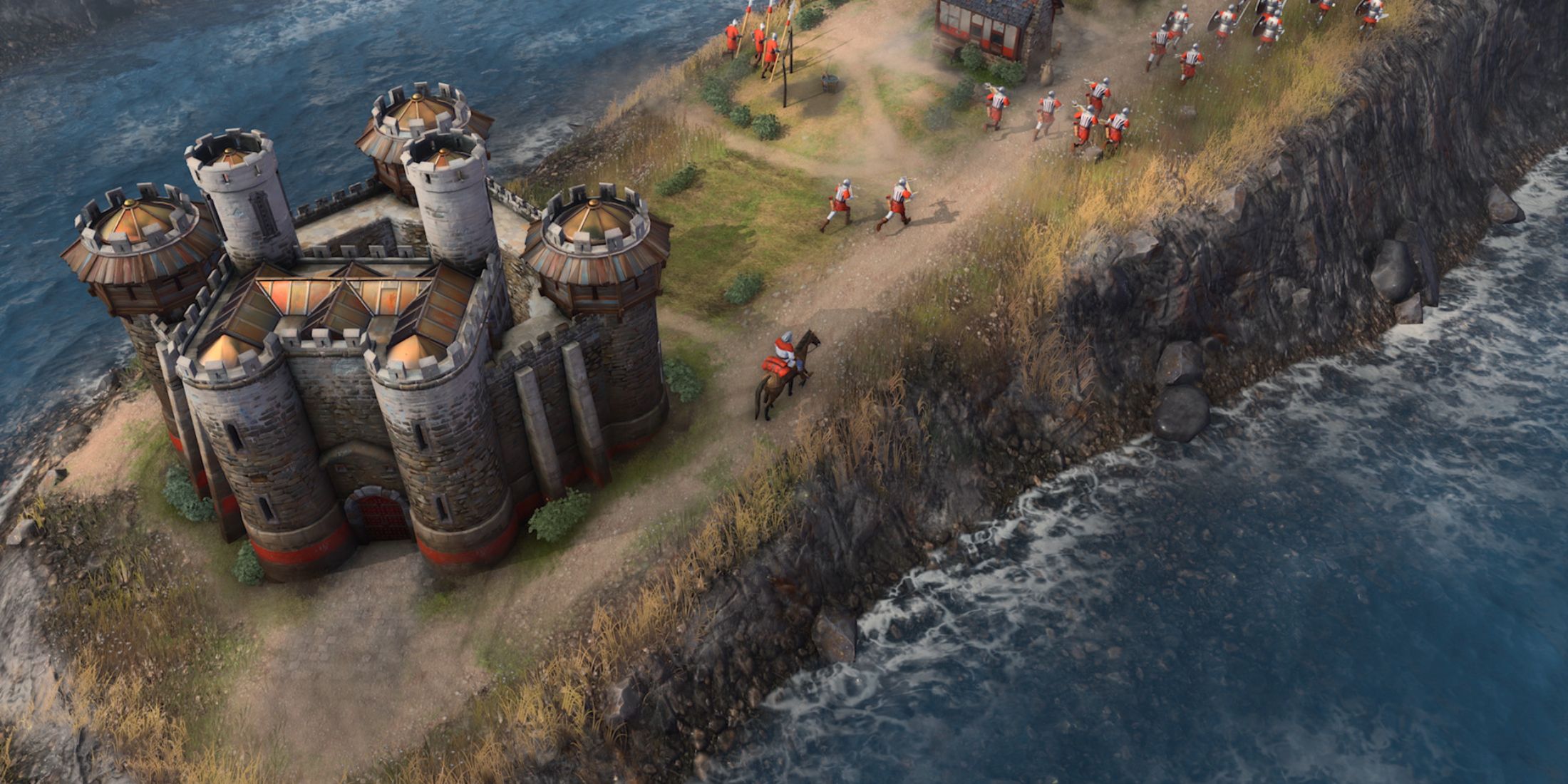
Rumor: Future Age of Empires Games Could Be Using Unreal Engine 5
A job listing online hints that the Age of Empires franchise could follow recent industry trends by moving to Unreal Engine 5 going forward.
The Art Team On Age Of Empires Mobile Talks Bringing The Franchise To The Small Screen
Q: How did the art process for Age of Empires Mobile begin? What aspect of the game’s art was worked on first?
A: So, at first, we really focused on nailing down the art style and getting the whole team aligned on the vision. We wanted a game that was epic, historically accurate, super realistic, true to the IP, and, of course, in 3D. Just as the Age of Empires series always has, we aimed to create a multi-civilization game that was both grand and historically grounded. Since we were focusing on history, realism was a must.
The 2D style that was popular at the time just wasn’t going to cut out for the immersive experience we had in mind. So, we took the leap and decided to go full 3D. Most mobile strategy games were 2D or 2.5D back then, but we embraced the challenge. It meant higher costs, intense performance requirements for rendering all those 3D assets on mobile devices, and basically pioneering a new path for mobile strategy games. But, given the nature of the IP, realism and depth were essential. We wanted to give players a mind-blowing visual experience. While the challenges were real, they also got us really excited. Our team’s experience in 3D game development gave us the confidence to break new ground.
Q: How much did the mainline series influence that starting phase? Did previous mobile games (Age of Empires: World Domination) play much of a role in the art direction?
A: So, Age of Empires was a huge inspiration for both our personal art style and the overall look of the game. It was basically the first game I ever played as a kid. My mom took me to my uncle’s place one Lunar New Year holiday, and I got hooked on it on his laptop. A lot of our team played it before they even started working, so everyone was super excited to work on a new Age of Empires game. When we were first figuring out the look of Age of Empires Mobile, we had a brainstorming session to share our visions. Most of us wanted to build on the classic Age of Empires art style and take it to the next level.
For example, with the Byzantine civilization, we stuck to the same color scheme as the original game, with orange as the main color. We also studied the architectural designs from the original game and used them as a starting point for our own designs. But since we were making a 3D game, we could add a ton of extra details. For the feudal age, we went with an early Greek and Roman style. The buildings used materials like wood, rough stone, and rammed earth for walls and had thatched, wooden, or crude tile roofs with various colors.
In the castle age, we leaned more towards a Roman/Italian style, with domes and mosaic tiles. We would take inspiration from some major design of the original Age of Empires and then tweak the details to fit our game’s specific mechanics and setting.
Age of Empires: World Domination, being an earlier mobile game, didn’t have much impact on our art style. With today’s powerful mobile devices, we can do so much more. We can render hundreds of thousands of polygons on screen at once for richer environments, and have hundreds of player troops engage in intricate battles on one screen at the same time.
Q: How much flexibility did the art team have with the game’s designs?
A: Strategy games are a bit more restrictive when it comes to art style compared to first or third-person games. Our fixed top-down view pretty much limits us to creating richer visual effects in depth. And since its gameplay requires flat terrain, there are even more constraints. Fortunately, by going 3D, we’ve been able to push the boundaries more than other strategy games. We can create layers of depth, from water to ground, buildings, mountains, and even clouds, giving players a real sense of verticality.
We’ve also divided our design areas into gameplay and non-gameplay zones. Gameplay areas need to be flat for combat and gathering resources, so we can’t do much with the art there. But we’ve focused on making non-gameplay areas as visually stunning as possible. For example, with mountains, we’ve created smooth transitions from the ground to the peaks, complete with forests, clouds, and birds. This creates a dramatic visual shift when players move from flat land to a mountain peak. We’ve prioritized these areas as high-value design zones to maximize the benefits of 3D graphics, giving players a richer and more immersive experience.
4:32
Related
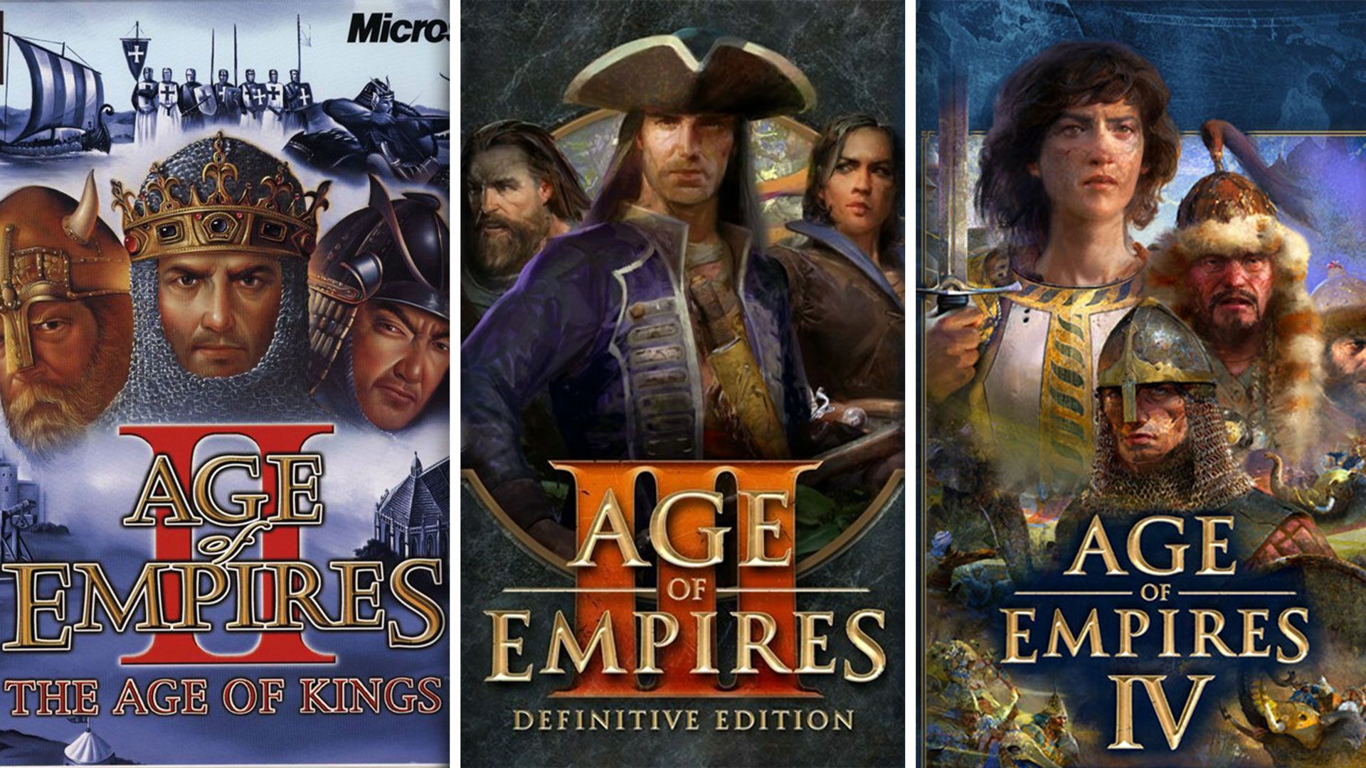
Every Age Of Empires Game, Ranked
Age of Empires is one of the most enduring franchises in gaming history and a cornerstone of the RTS genre. What’s the best title in the series?
Balancing Historical Accuracy, An Epic Tone, And Mythology In Age Of Empires Mobile
Q: Figures like Julius Caesar and Joan of Arc have appeared in previous Age of Empires games, yet their designs are quite different in Age of Empires Mobile. Was this a deliberate choice?
A: Yeah, it wasn’t a simple process. Take Joan of Arc for example. In the early Age of Empires II, she mostly appeared as a mere illustration. Those were beautiful paintings indeed, but it wouldn’t have translated well into our 3D, realistic style. When creating textures, the brushstrokes in traditional paintings can really water down the realism, especially for things like skin. Achieving a highly detailed, painted look would have been a lot of work and required super high-resolution textures, which just wouldn’t work on mobile devices. So, we decided to go for a more realistic style and use a physically-based rendering (PBR) workflow for our 3D models. At first, we didn’t go full-blown realistic, but when we tested it, players seemed to really dig the direction we were going. That solidified our decision, and we pushed even further towards a more realistic look to create a consistent visual style throughout the game.
Q: What was the process like for designing historical figures who have never appeared in Age of Empires, such as Miyamoto Musashi?
A: It was a really fun process, actually. Miyamoto Musashi is a super interesting character with a ton of stories and legends surrounding him, so there’s a lot of room for creative interpretation. And Japanese samurai culture is a huge part of Japanese history, and Musashi is an unavoidable figure in that. So when we decided to create a Japanese civilization, and we already had Oda Nobunaga, Musashi just naturally came into our mind. For his design, we wanted to give him a more rebellious and unconventional look. We envisioned him as a lone wolf swordsman, hence the straw cloak and conical hat. We wanted his overall look to be agile and dynamic, which is a bit different from the serious, formal look you’d expect from a samurai duelist. But we kept some of his iconic traits, like his dual swords from the Niten Ichi-ryū style and the traditional attire of an Edo-period swordsman.
Q: Age of Empires Mobile includes figures that blur the lines of fiction and historicity, such as King Arthur. What was the design process for characters that are more mythology than history?
A: Compared to Miyamoto Musashi, who was a real historical figure, we had more creative freedom with King Arthur. We used his various stories as a starting point for more imaginative interpretations. With King Arthur, we wanted to distill his character from tales that were less historical and more fantastical or mysterious. For example, we looked at his stories and pulled out empathizing keywords like “the leader of chivalry,” “brave,” “righteous,” and “handsome.” And because he was often depicted as a mounted warrior, we gave him a strong, sturdy upper body, a simple yet regal crown, and, of course, Excalibur. We used these elements as a starting point for our design. Since many of our references for King Arthur had a touch of magic, our final design for him has a slightly more fantastical feel compared to other characters.
Q: How intensive was the research for the game’s art? Was historical accuracy a priority?
A: When we first nailed down the art style, we aimed for a balance of 85% historical accuracy and 70% epic. This is not an absolutely accurate number, but we have roughly aimed for this tone.
So, we definitely prioritized historical accuracy, but we’d adjust as needed for gameplay. Building on this foundation, we decomposed a civilization as much as possible along the dimension of time. This is a reflection of depth. For example, with Japan, we identified the major eras and then found references for contemporary architecture from those periods. We then extracted specific materials and styles. For feudal Japan, we positioned the architectural style corresponding to the periods of Asuka, Nara, and Heian periods. Since it was an earlier period, we focused on more primitive materials like mud and wood. Depending on the function of buildings, for example, residential houses would have mud and wooden walls and thatched roofs, while more important buildings like the town center would have wooden walls.
Q: How much cultural consultation took place during the art process? Were there any pitfalls in representing a diversity of cultures and periods that you wanted to avoid, and were there any you were specifically instructed to avoid?
A: Whenever we decided to add a new civilization, we spent about two months diving deep into research. We scoured books and movies and even visited historical sites. We also sought help from local friends, colleagues, and partners to deepen our understanding. We had the most communication with World’s Edge, who provided us with artistic development experiences for multicivilizational games and lots of relevant materials extracted from their development experience with the Age of Empires series and the preferences of their fans. They also combined their own multicultural backgrounds and those of player communities to provide us with more emotional suggestions and brainstorm with us.
Additionally, we consulted experts and scholars from different cultural and academic backgrounds. For example, we brought some ideas, demos, and concept art to them for feedback in the form of seminars. Player feedback was also essential for our artistic development. We paid close attention to player interviews, testing feedback, and community discussions to understand players’ views and expectations of our art style and make targeted adjustments accordingly.
Since our game is multicivilizational, accurately representing different cultures and historical periods is crucial. Mishandling this aspect could easily mislead players or diminish their impression of our game. For instance, oversimplification or distortion of history are pitfalls we strive to avoid. We also consider changes arising from historical transitions as sensitive issues, which we try to steer clear of when uncertain.
Q: What civilization proved to be the biggest challenge for the art team and why?
A: Chinese civilization. It might sound weird that we found it the most challenging, especially since we’re a Chinese team, right? The reason for the challenge is that this is the first civilization we have worked on. At that time, we thought starting with something we were most familiar with would help us establish a solid foundation. Once we figured out the basics with China, tackling other civilizations would be a breeze. So, all the technologies related to the production of the citadel were developed when we were creating the Chinese civilization. For example, buildings that can be freely placed. And have you noticed how the roads between buildings automatically adjust when you move those buildings? Or the patrolling soldiers who pause and interact when you tap on them?
Then there’s the water. Creating realistic water effects, especially waves, was incredibly challenging. Water is complex with its transparency, the sheer amount of textures we need to sample, and so on. It’s easy to overload the system. So, we had to make tough choices about what was most important—like transparency and wave effects. It was a lot of trial and error. However, all of these were completed when we were creating the Chinese civilization. So, perhaps it’s because we developed the technologies and rules needed to create an entire civilization while working on the Chinese civilization that it posed the greatest challenge.
Related
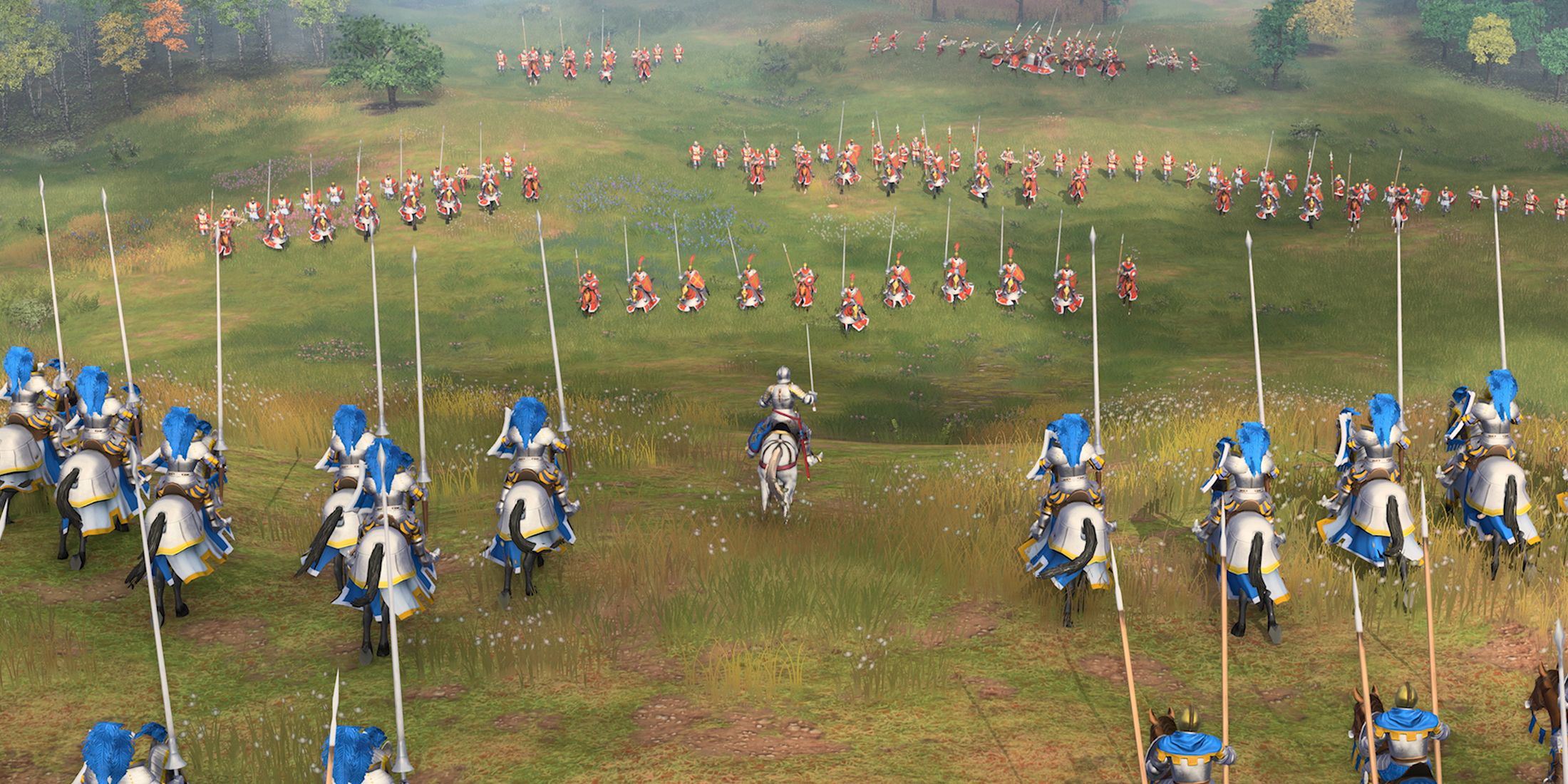
Age of Empires 4 Has Big Plans for 2025
Age of Empires 4 co-developer World’s Edge reveals what’s in store for fans of the beloved real-time strategy experience in 2025.
The Technical Challenges Of Age Of Empires Mobile
Q: What techniques did you use to maintain visual clarity during big battles?
A: It’s a pretty complex issue that directly impacts the player experience. Large-scale battles and sieges are a big part of the game, but with so many units on screen, it can get chaotic. It’s one of those situations where tech alone can’t solve everything; we had to make some tough choices. Our art and design teams went back and forth on this for a while. Designers were always complaining that players were getting lost in the chaos of siege battles.
To solve this, we focused on simplicity for clarity. The art team reduced unnecessary visual clutter while maintaining a high-quality aesthetic. However, simplifying too much could make things look cartoonish, so we opted for simplifying structures while building upon realistic textures to aid visual clarity through design. A lot of the heavy lifting was done by our UX and programming teams. For instance, our UX team created a feature where players can drag the hero portraits on the right side of the screen to quickly find their units. It’s a simple but effective solution. I personally use this feature all the time. Then there’s the issue of performance. No amount of visual clarity helps if the game is running slowly. Our programmers developed several optimization techniques for large-scale battles, like different levels of detail for our models. During large-scale battles, the game dynamically adjusts the model quality based on the player’s device specifications. For example, if there are 30 troops on screen simultaneously, the lowest level of detail models will be automatically rendered to ensure a smooth framerate.
Q: What challenges did AoEM‘s realistic terrain and weather systems present to the art team?
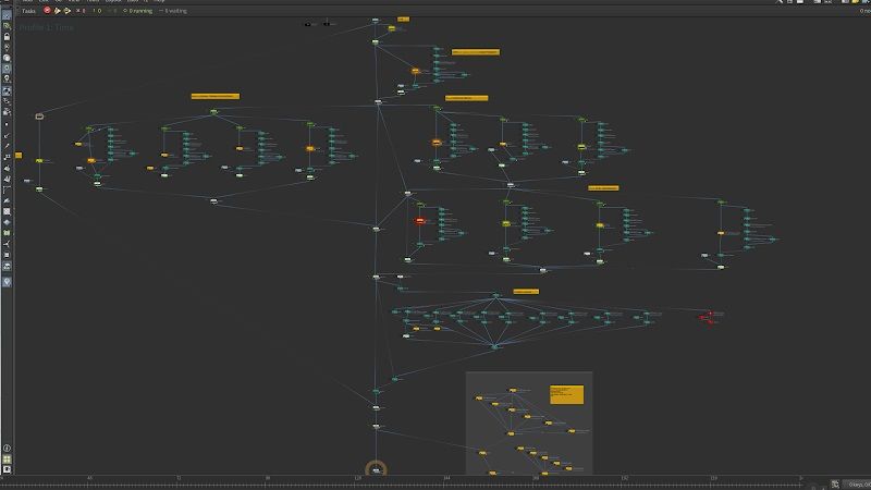
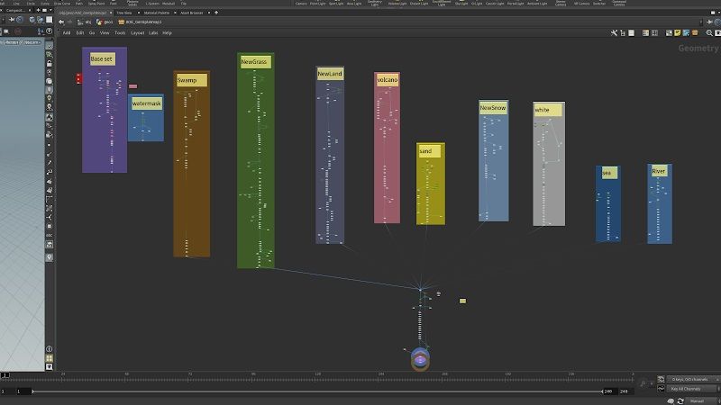
A: Creating the terrain was a big challenge because the map in Age of Empires Mobile is absolutely huge. Manually creating something that large would have been a nightmare due to the overwhelming human resource cost involved. As a solution, we developed a procedural dependency graph (PDG) to automate the process. Our PDG system is quite different from what you’d find in traditional AAA games. While PDGs are commonly used in open-world games to quickly build worlds based on rules, our game’s heavy reliance on flat gameplay areas meant we had to rethink the rules entirely. For instance, in a typical AAA game, you might determine where to place vegetation based on elevation, slope, and underlying materials. But with our flat terrain, these rules were useless. So, we had to design a completely new set of rules tailored specifically for a strategy game. It was a huge challenge, and we were basically starting from scratch.
Here’s the final node graph for our PDG system:
And here’s a closer look at one of the sub-nodes, “splatmap.hda”:
As you can see, the entire network is incredibly complex, and putting together the whole thing is quite challenging.
Weather effects, on the other hand, were relatively straightforward to develop. The real challenge was tying them directly into gameplay mechanics. For example, when a storm hits, it often includes game effects like slowdowns or damage. We tied these effects to our game’s grid system, which made it clear to players where the effects were taking place. But this grid-based system can sometimes create a very “blocky” look, which can be jarring for the art team.
Despite this, we believe weather effects add a lot of fun to a strategy game. So, we tried to minimize the grid-like appearance while without compromising gameplay clarity. For example, we made storms dynamic and moving, rather than static grid-based effects. We also added more natural-looking textures to snow edges and gave swamps more organic curves.
Q: Is there any art that didn’t make it into the final game that you can share details on?
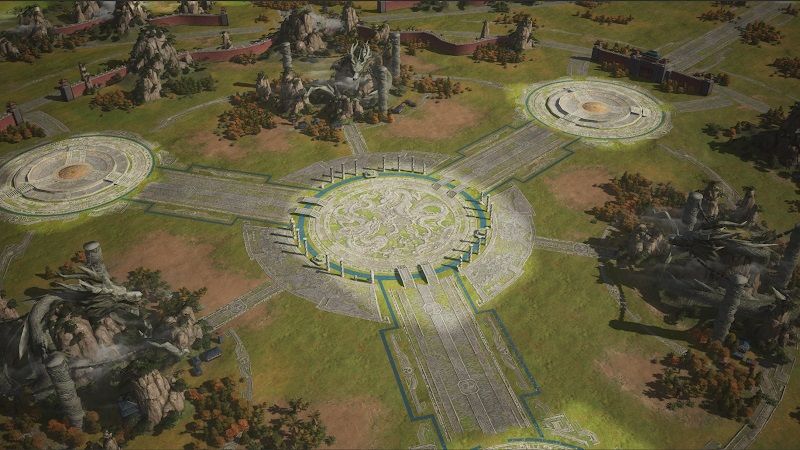
A: We actually experimented with an island featuring massive dragon statues. Personally, I was a huge fan of it! Dragons are one of my favorite mythical creatures, and from an artistic standpoint, these huge creatures can create a very majestic atmosphere. The team had a blast working on it. But during testing, a lot of players felt that this element was a bit too over the top and didn’t fit the overall realistic style of the game, which confused players. So, to respect their feedback, we decided to cut the dragon island from the final game. It was a tough call, but I understood why we had to make that decision.
[END]








Leave a Reply