Key Takeaways
- Dragon Age: The Veilguard has pretty awful facial animation, roughly on par with Dragon Age: Inquisition, a game that came out a decade ago.
- This isn’t the end of the world, I know. Triple-A budgets are already high enough with the constant pursuit of photorealism, and I’m not going to die on the hill of characters needing to look perfectly real at the cost of game development getting more untenable than it already it.
- Still sucks, though.
If you’ve played Dragon Age: The Veilguard, you already know the character lip syncing during cutscenes and dialogue is abysmal. You might even know this if you haven’t played it yet. Even before the game was launched, and all we had to judge the game from was its handful of trailers, fans were already complaining that the facial animations were whack.
BioWare games have never been known for great facial animations – in fact, I’d go so far as to say they’re known for having pretty stiff characters. Mass Effect Andromeda, in particular, was full of characters with robotic, blank faces and weird blinks which would see it lambasted by fans until a major patch was issued. By then, most of us had moved on.
This hasn’t stopped its games from being legendary RPGs, but you’d expect the animations in Veilguard to be significantly better than Dragon Age: Inquisition, considering that game came out a decade ago and technology has improved in leaps and bounds since then. But they aren’t.
Related
Dragon Age: The Veilguard Is Not Welcoming To New Players
What can new players expect to learn about Dragon Age from its newest game? Not all that much, it turns out.
There Are Worse Things In The World Than Bad Facial Animation
It’s easy to be disappointed by this considering how triple-A games look nowadays. The industry chases photorealism like its existence depends on it. We’re increasingly seeing games, especially big budget ones, marketed on the strength of their visual fidelity alone – it’s all 4k resolution this, 60 frames per second that.
That isn’t necessarily a good thing – this pursuit of improved visuals is a huge factor in game development times and budgets growing bigger and less sustainable. I’d much rather a studio have awful facial animation than go broke trying to achieve perfection. BioWare already had a tough time developing The Veilguard, with several delays, a total change in concept, and prominent members of the team getting laid off.
Considering all these different factors, I’m not going to die on this hill. As is always the case, the developers did the best they could with the resources they had – no studio is settling on subpar animation because they don’t want the game to be the best it can be. In fact, in general, the visuals are hugely improved, and the game looks incredible in places. I, along with pretty much every other Dragon Age fan, have been making heavy use of its photo mode. It’s just that it doesn’t look great while you’re actually playing it.
Related
Dragon Age: The Veilguard Has Discarded Nuance
Dragon Age: The Veilguard sidesteps uncomfortable topics, and removes moral greyness.
What Does Bad Animation Take Away From A Game?
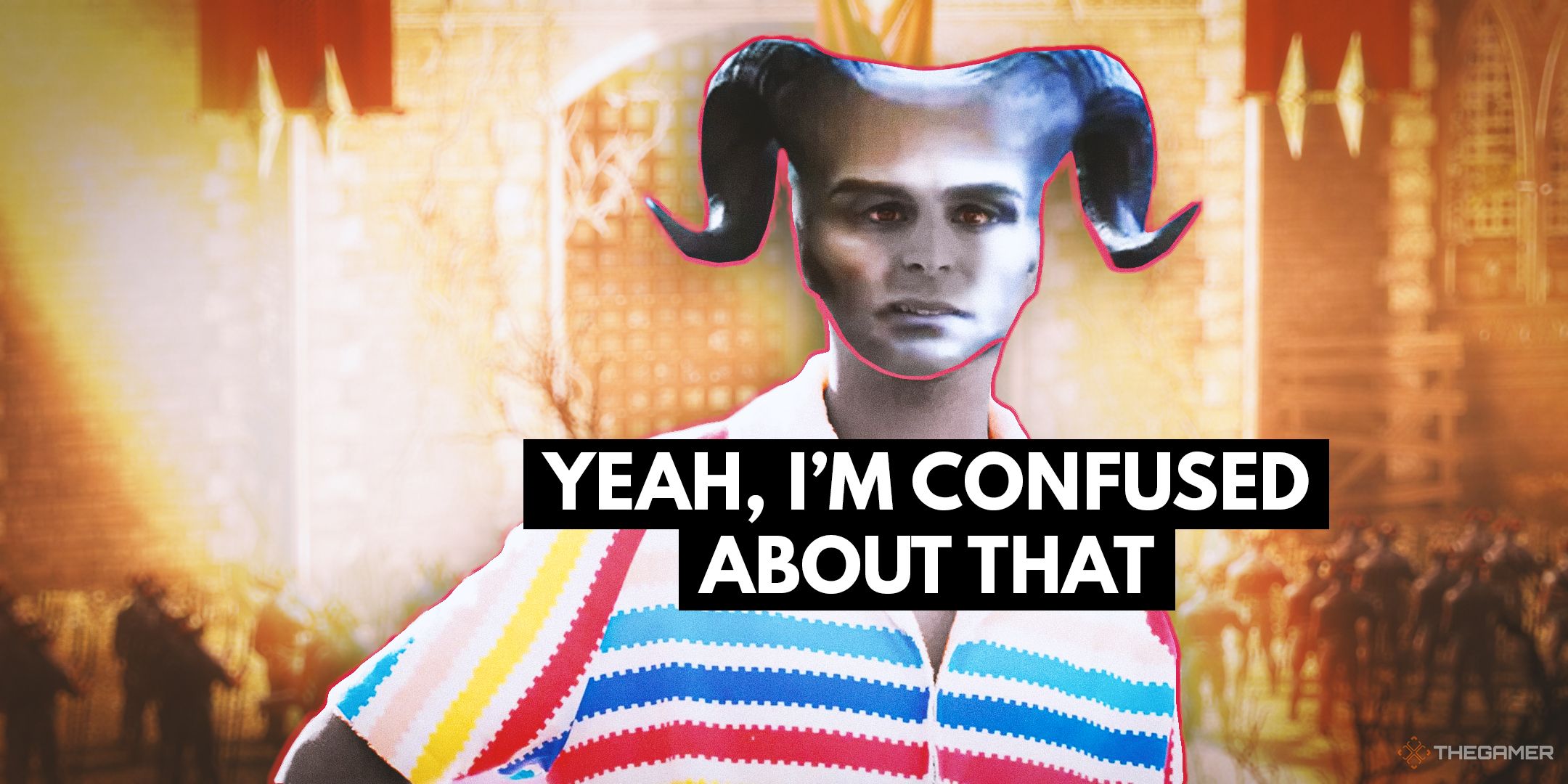
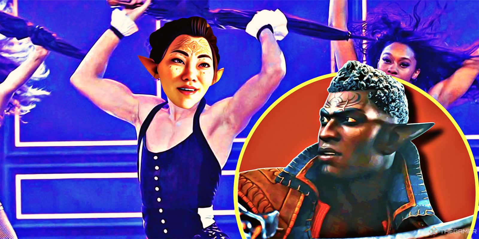
Despite this, the facial animations still leave much to be desired. When characters talk, especially my Rook, it often looks like their mouths are forming completely different words from what we hear. Maybe it’s just me, but I feel a disturbing jolt of uncanny valley whenever my Rook or any other major character cracks a smile. My colleague Ben Sledge hated this so much his Rook now wears a crow mask everywhere. Everywhere.
As a side note, what’s with the smiles? It looks like everyone’s got veneers.
With an RPG like this, characters are everything, and good animation often elevates good writing to make the cast more believable. I know everybody hates when The Veilguard is compared to Baldur’s Gate 3, but look at Baldur’s Gate 3 for a second. If the animation had been jerky and stiff like The Veilguard’s, people probably wouldn’t have been thirsting over Astarion or Shadowheart nearly as wholeheartedly.
It feels especially disconcerting to see janky animation in a triple-A game when, as many fans have pointed out, the vast majority of big budget games have long surpassed this level of quality. Red Dead Redemption 2, which launched six years ago, looks miles better. It may not have been feasible for The Veilguard to have implemented better facial animation – especially while maintaining its lower, more accessible specs – but I still wish it had, because it’s distracting. So much attention has been paid to its absolutely stunning environments, but its animation feels decades old.
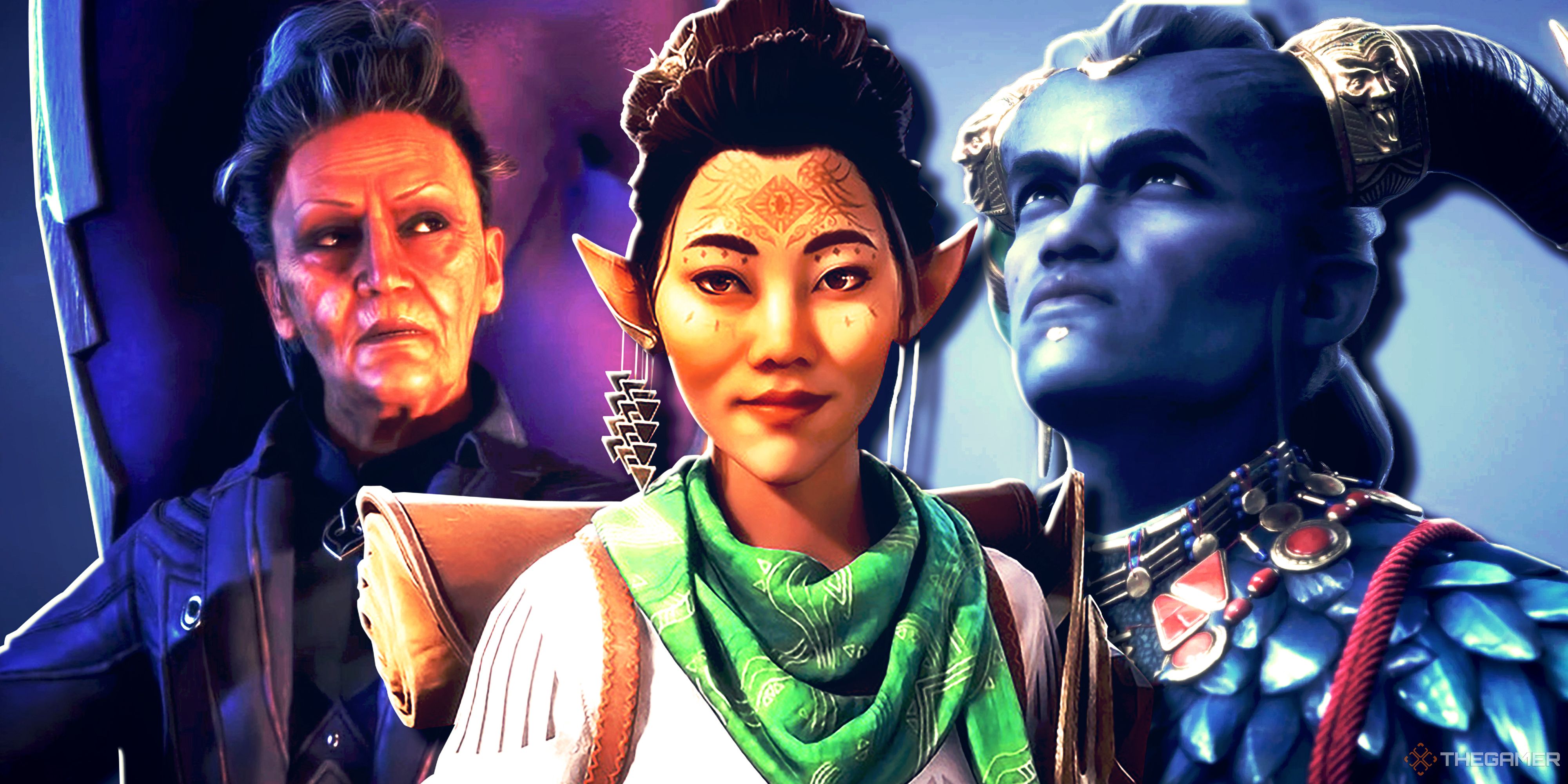
Add this on top of a controversial stylisation of character models, and The Veilguard looks kind of like a weird cartoon. I’d rather have my characters look like they’re speaking normally than be able to see every freckle on Harding’s face, but that’s just me. It could have worked, but as someone who’s personally not a fan of the new art style, the wonky animation is just another thing to cringe at while I play.
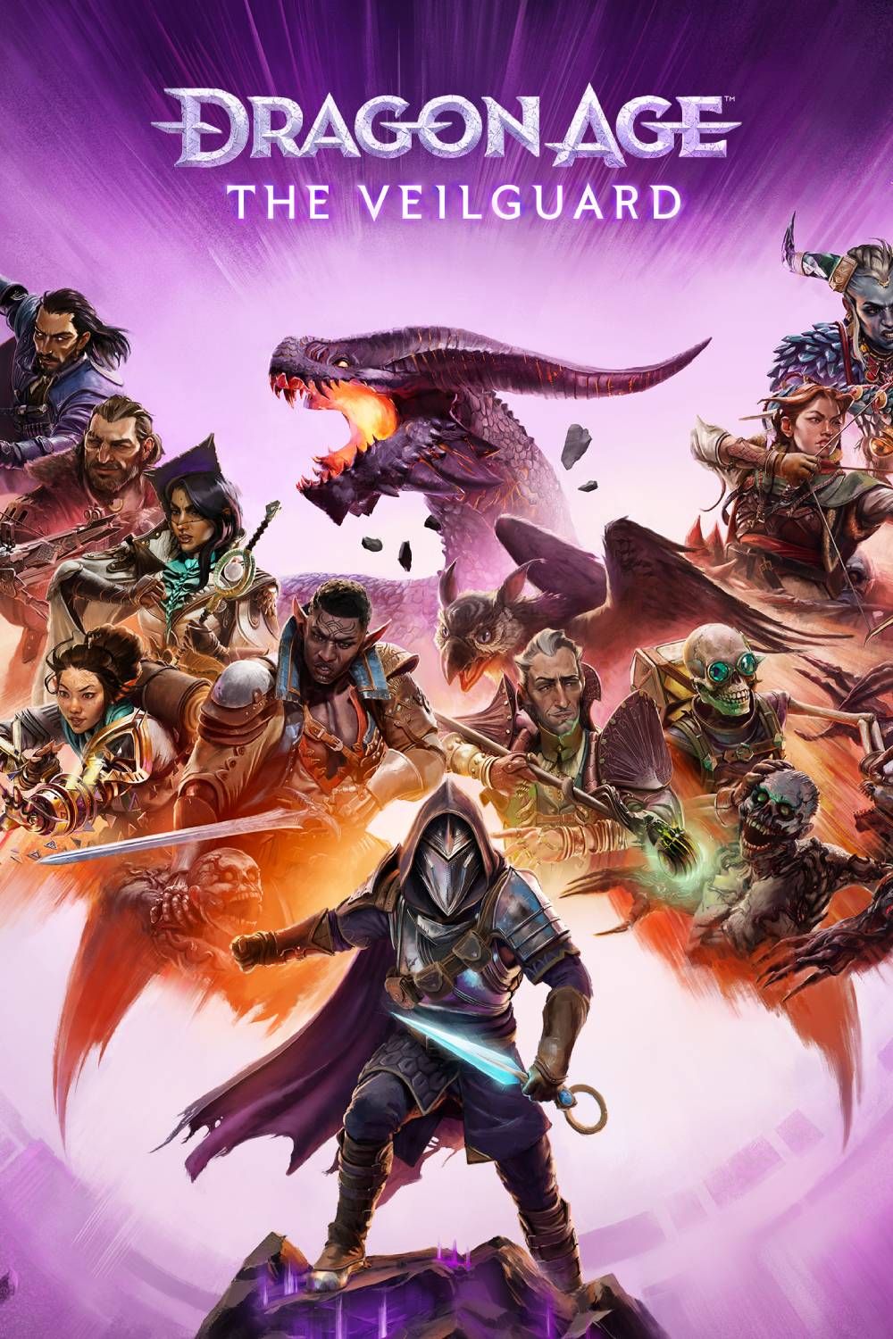
Dragon Age: The Veilguard is the long-awaited fourth game in the fantasy RPG series from BioWare formerly known as Dragon Age: Dreadwolf. A direct sequel to Inquisition, it focuses on red lyrium and Solas, the aforementioned Dread Wolf.
Leave a Reply