The launch of Dragon Quest III HD-2D Remake is fast approaching on November 14. We had the opportunity to sit down for an interview with the game’s producer, Masaaki Hayasaka, to chat about this stunning remake that brings back the iconic masterpiece in HD-2D.
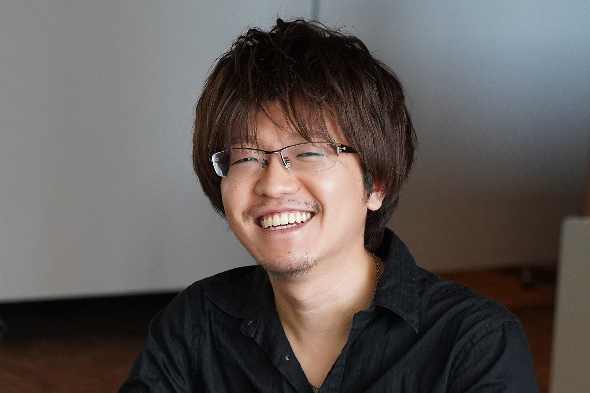
Masaaki Hayasaka
Producer, Dragon Quest III HD-2D Remake
How HD-2D graphics draw out the full potential of this retro classic
PlayStation Blog: HD-2D has become much more popular since games like Octopath Traveler. What are some of the unique characteristics of this visual style?
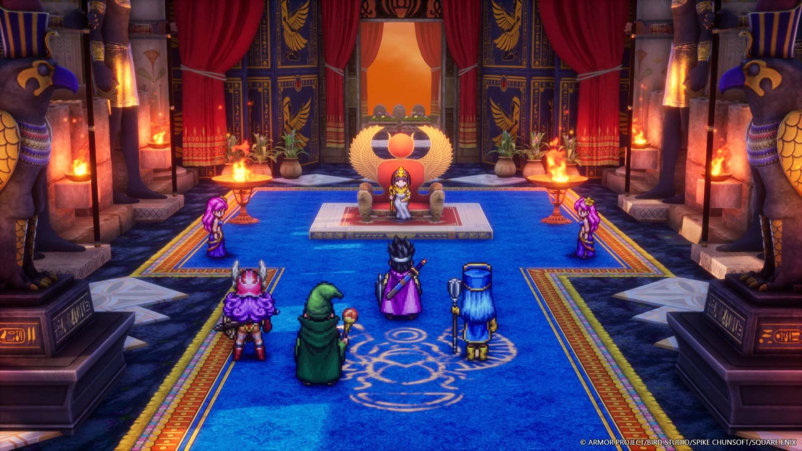
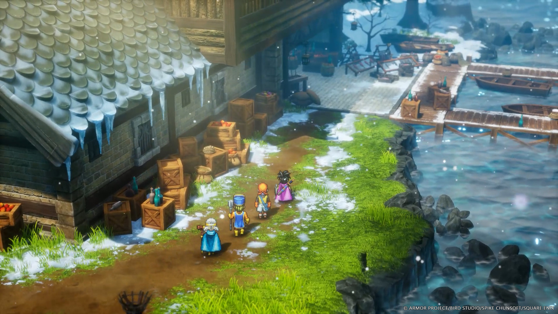
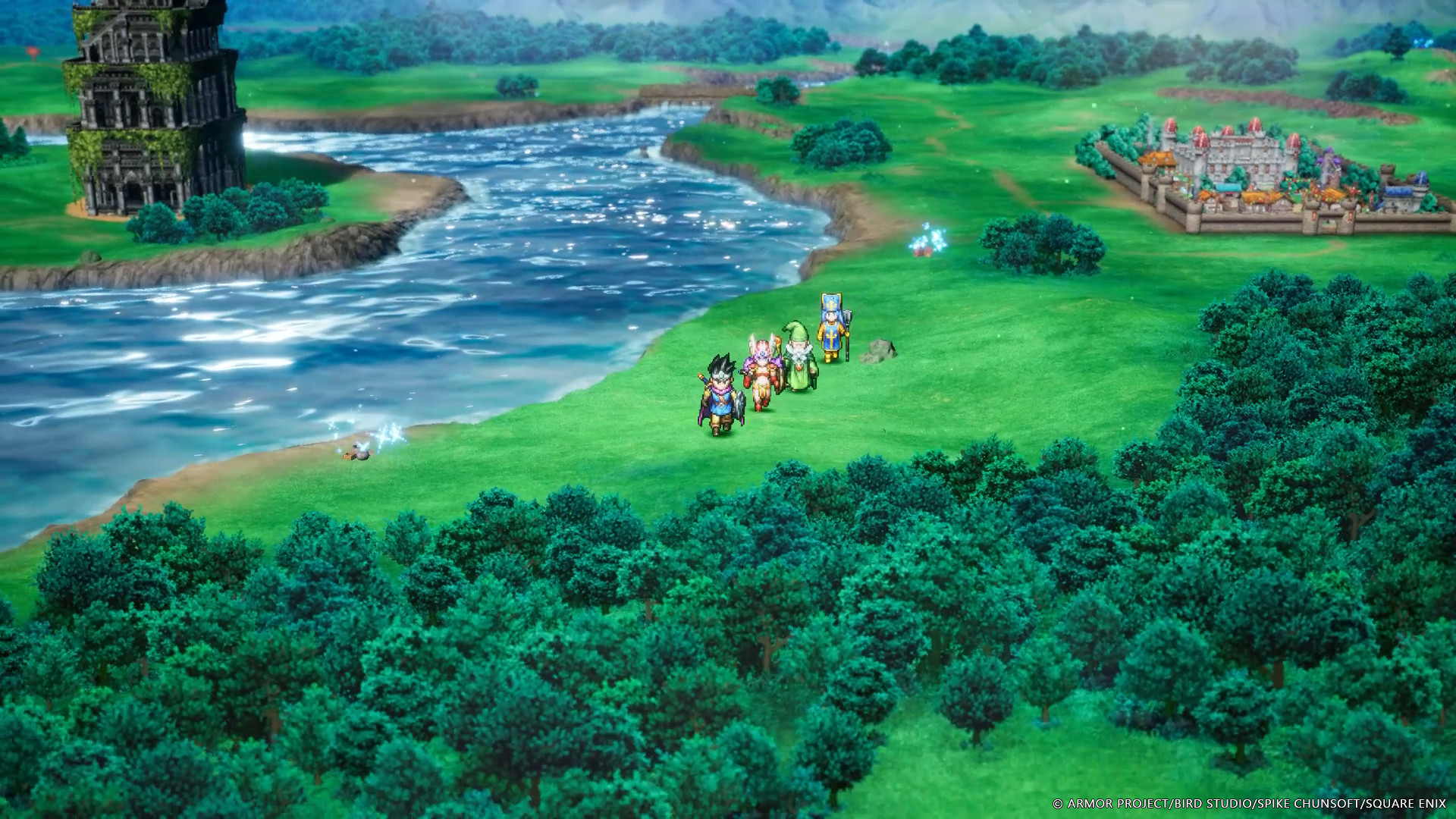
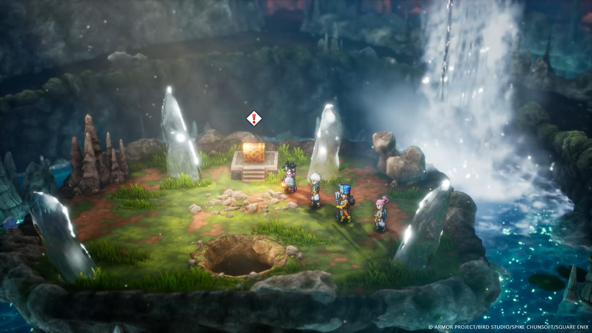
In a nutshell, HD-2D is a visual style that combines pixelated characters with 3D backgrounds. Personally, I think this style works better in retro titles. When the original game first came out, players roamed the world while picturing how beautiful the landscapes must be. HD-2D actually brings that world to life.
Even though the game adopts HD-2D, it is still immediately recognizable as Dragon Quest III. What do you think are the most important aspects needed to achieve the iconic Dragon Quest-style?
The most obvious is the color palette. Dragon Quest games are characterized by rich, vivid colors, so we aimed to fully embrace that in the remake as well. If you compare the original game and the HD-2D remake side-by-side, the graphics will look completely different. Even so, the color palettes are similar so it shouldn’t feel far off from what OG players remember.

Built in tandem with Yuji Horii
What sort of discussions did you have with Yuji Horii (creator of the Dragon Quest franchise), during development?
We connected regularly from the early phases of planning till the very end of development. We exchanged a lot of details. We discussed everything from new features like the Monster Arena and additional narrative episodes, to the game balance of battles, and even the size of the character pixels.
Did you make any changes based on Yuji Horii’s recommendations?
He made a comment around the blurring of the game background, and I find that particularly memorable. Background blur in games is usually referred to as depth of field, which is a technique also used in photography. In HD-2D, depth of field is extremely important. We had previous experience working on HD-2D games, so we thought we’d already mastered the sense of implementing background blur. However, when we showed it to Horii-san, he said that the blur was far too intense, and it made him feel like there was something wrong with his eyes. He then asked us to dial back the intensity. We were quite shocked, in a good way, by his suggestion from a player’s point of view. However, as a result, this change made Dragon Quest III stand out from other HD-2D titles, so his recommendation was on point.
So, different games leverage HD-2D in various ways?
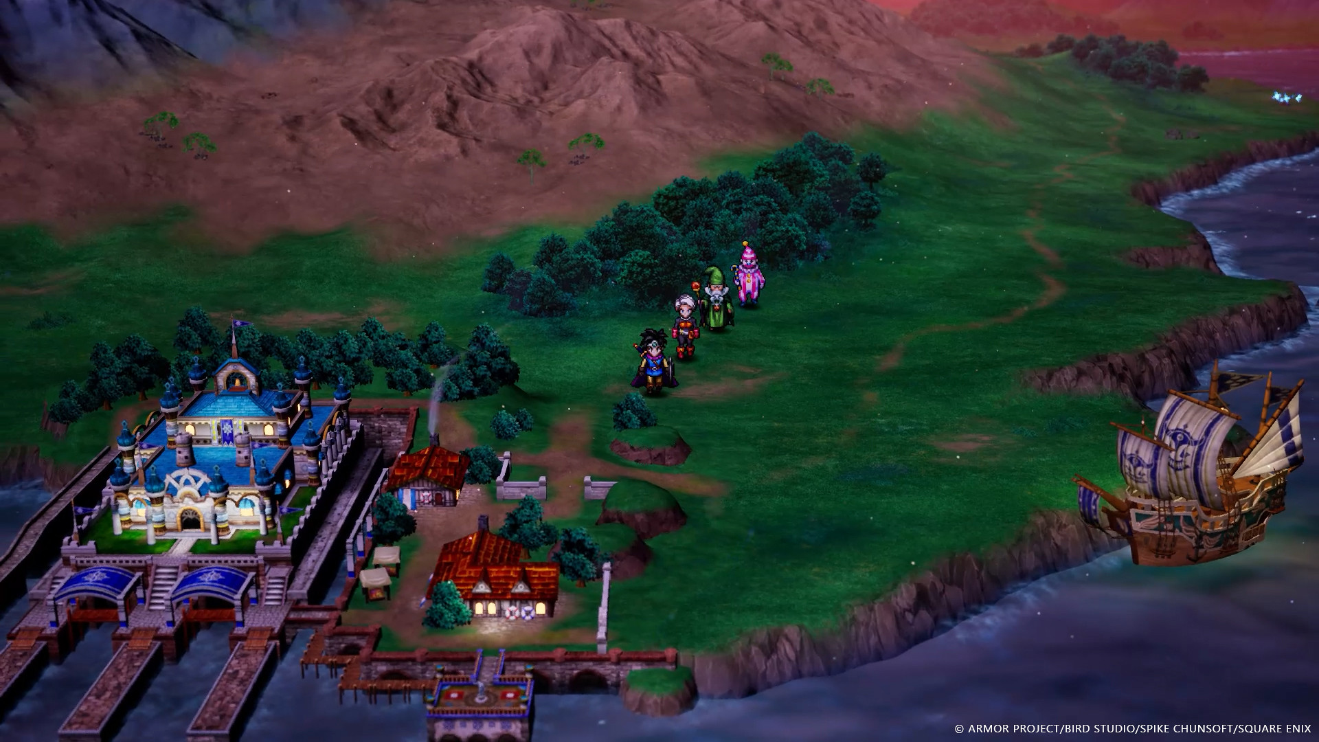
Absolutely. The only common thread between all HD-2D titles is that they place pixelated characters in a 3D world. Otherwise, every title is completely unique. For example, Octopath Traveler incorporates pixels in the background as well, but Dragon Quest III does not. The characters’ body proportions and pixel size also vary depending on the title. Dragon Quest III is the first-ever HD-2D title to integrate a world map where players can actually wander around.
Is the distance between towns the same as the original?
The layout of the buildings is exactly the same, but the scale of the map and distances have been changed. The most difficult part of the development process was scaling the map. If we had made the map as dense as the original, the game would have felt too compact in both volume and appearance. On the other hand, if we made the map too large, it would lose its perfect pacing and slow down the game. We spent a lot of time adjusting to find the ideal balance in terms of both look and feel. If you watch the teaser trailer that was released at the time of the announcement, you will notice that the scale is completely different from the finished version.
The passion behind the new character customization feature
In the remake, players can customize the appearance, like hair color, of party members. Why did you decide to add this new feature?
In the original, when you changed a character’s vocation from Martial Artist to a Mage, the young man suddenly turned into an old man and there was no way to alter it. I personally felt that was a bit strange. Character creators or customization is very common in modern games, so I thought players would find it a bit confusing if we kept it like the original. Character customization was intended to make the game feel more modern.
To tell you the truth, out of all the new features we added in the remake, I’m most passionate about the character customization. I proposed it to the development team, and even when they refused, saying it was unnecessary, I kept pushing that it was absolutely crucial [laughs]. I spent about three months working on it, so it would mean a lot to me if players spent some time creating their own distinct characters.
Even though you can change their appearance, the main colors for each vocation are the same as the original. How did you decide what to change and what to leave untouched?
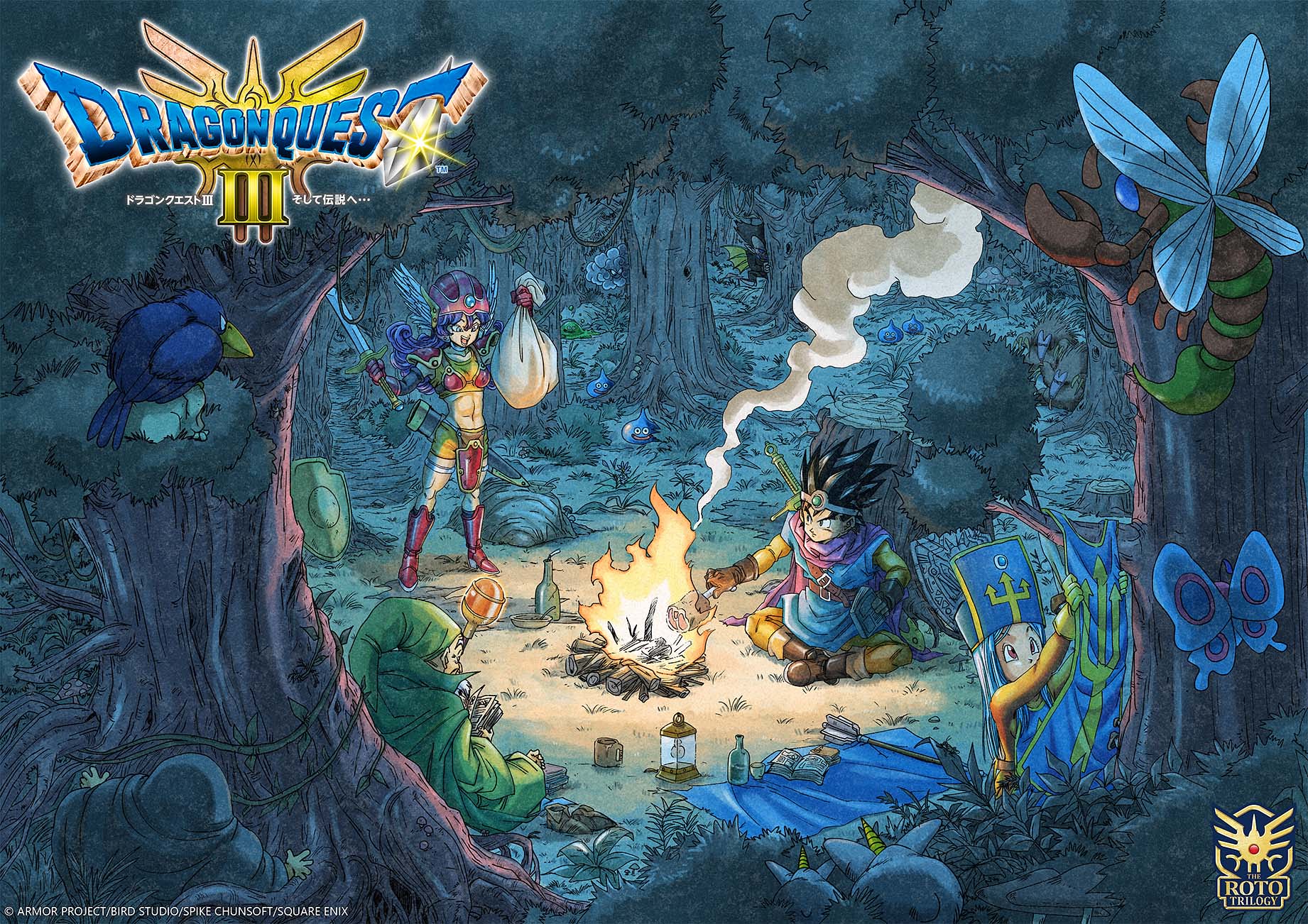
I believed it was important to respect the vocation colors that Akira Toriyama originally designed. We didn’t change any of the main colors, so it’s easier for players to distinguish between each vocation at a glance. However, we wanted to give players the freedom to play around with hats and hairstyles as a fun new feature.
Leave a Reply